Make yourself familiar with StructrStep-by-Step Tutorial
Goal of this document
This document is intended for beginners to familiarize them with the essential elements of Structr as a tool for creating a simple, interactive web application.
The best way to learn Structr is to use it. Therefore, in the following sections we will build step by step an increasingly complex application. We start with a base application that contains a very basic data model, some example data and a very simple page to display the data. Once this base application is finished, we refine the application’s user interface from a simple table-based layout to a more visually appealing card design. This follow-up section showcases Structr’s capabilities for importing existing web pages as well as the templating mechanisms that allows to quickly create a custom design that can be used across all pages of an application.
The next step is to add images or other files to the application. This follow-up section provides a brief introduction to Structr’s virtual file system and its available system data types. After that, we show how to add editing functionality to the application. using Structr’s integrated edit mode that allows users to edit the content of a web page inline.
Finally, we cover simple extending the data model by adding additional data types such as Task and Deadline to the project. This section focuses on more advanced functionalities of the Schema Editor.
A First Simple Page
In this section we develop the basis for our simple project management application. This first version will only have the capabilities to manage Project objects which each have a name attribute. We start by creating a very simple webpage with some static content. Next, we create a data model and some simple test data. And finally, we modify our simple webpage such that it dynamically fetches and renders our test data from the database.
Create the Page
Pages are the basic elements to render static and dynamic content. While static content is always displayed exactly the same way, dynamic elements are created by combining markup with data retrieved from a data source, usually the internal database.
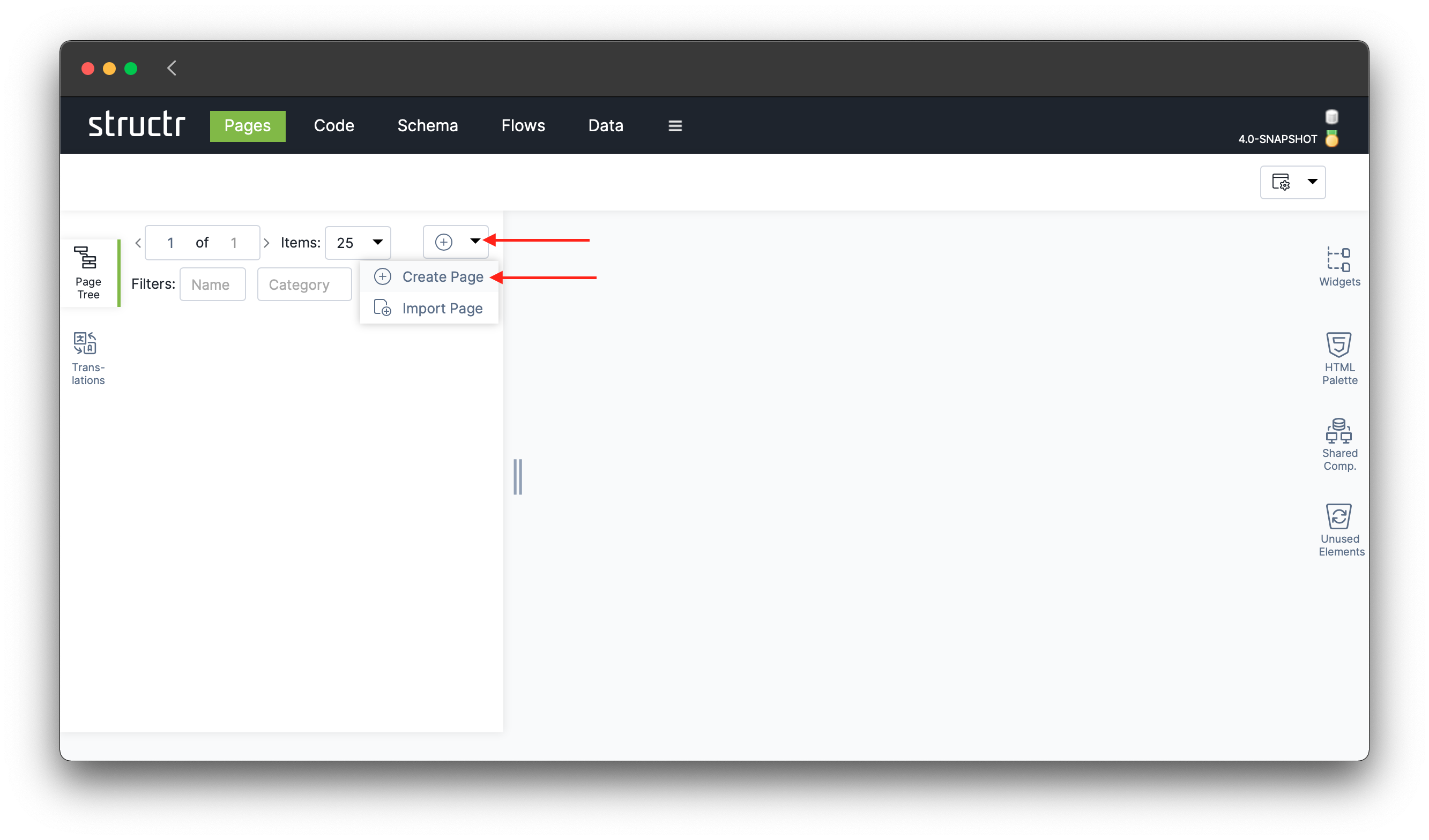
To create a new page in Structr, we navigate to the Pages area by clicking on the ( ) in the main menu and click on “Create Page” in the dropdown menu in the top-right corner of the Page Tree. This creates a fresh page with a minimal hierarchical structure, the so-called DOM tree, which can be navigated in the Page Tree in the navigation pane on the left-hand side. Clicking on the page element will display a set of basic attributes in the main area.
Tip: When double-clicking on the page element in the tree, the page opens in a new browser tab.
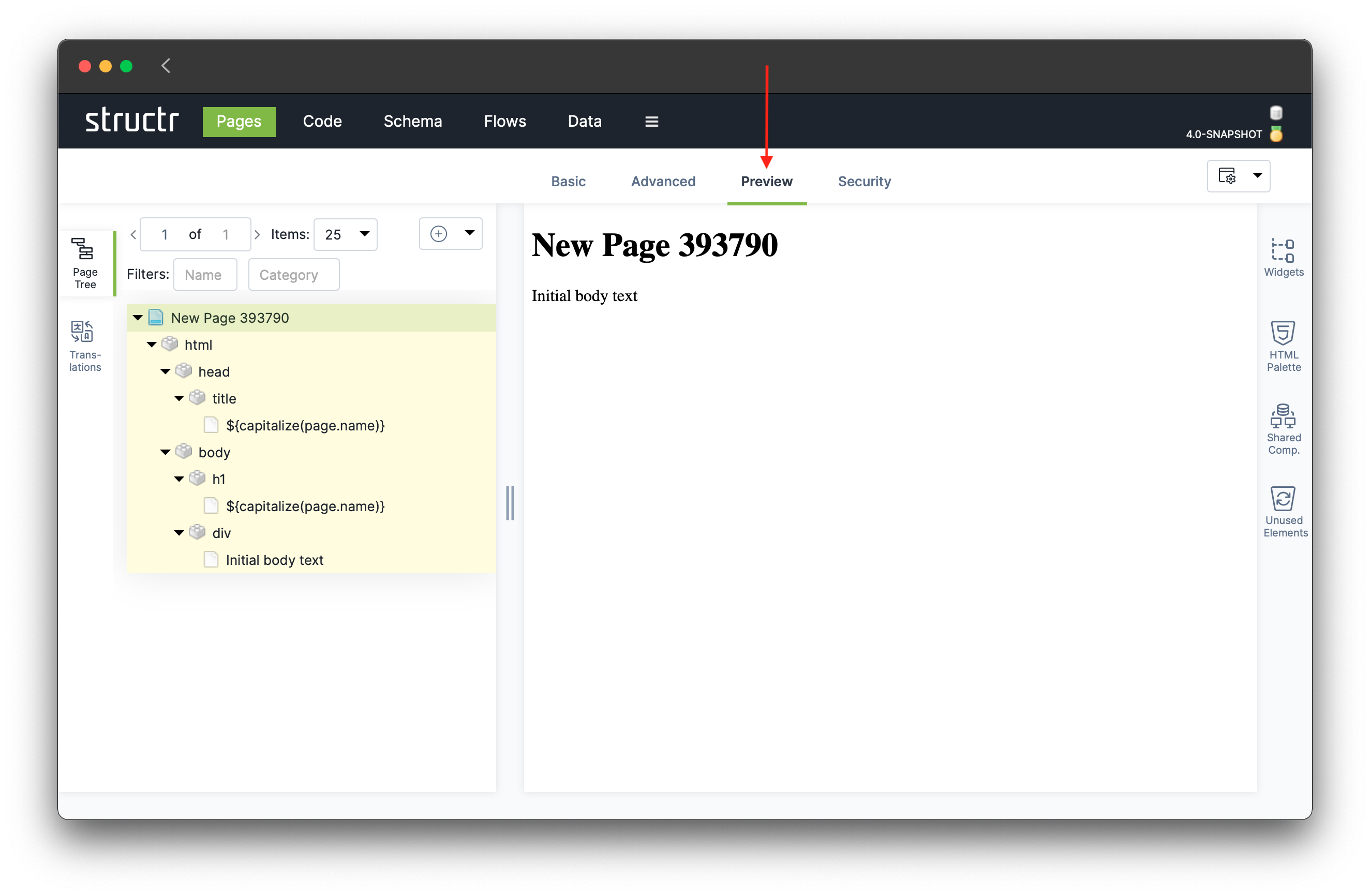
To display a preview rendering of the page, click on the Preview tab in the functions bar above the main area.
In preview mode, you can edit static content inline by clicking on a text fragment of a page.
The elements of a page are organized in a tree structure, the so-called DOM tree. Specific nodes in the tree can be expanded or collapsed to navigate through the tree. For more details on the user interface, see
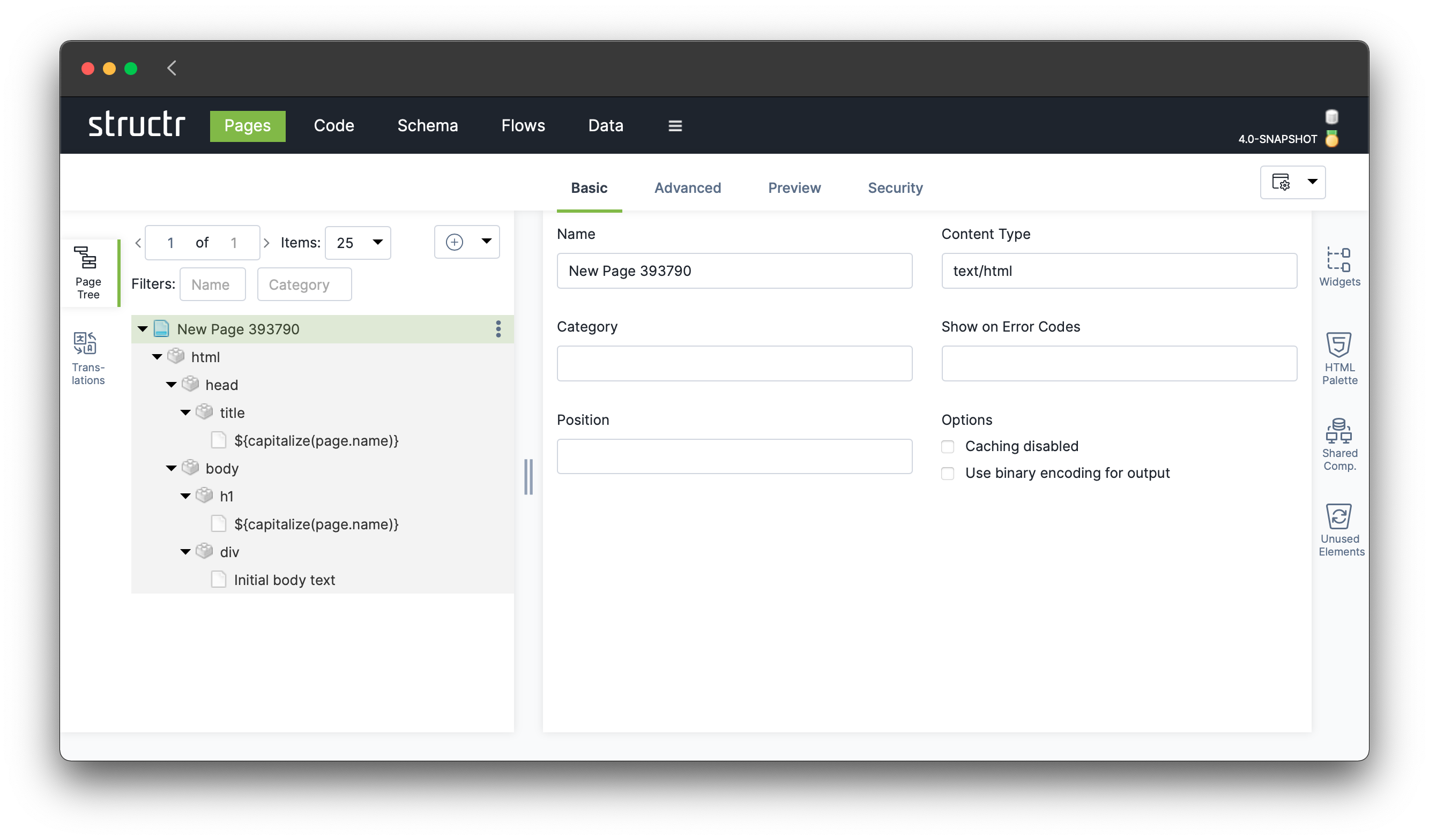
The initial structure of our new page includes a page <title>, and a <div> inside the page’s body. We will look at these elements now and fill them with appropriate content.
Page Title
The page’s title currently contains a so-called content element. Content elements are nodes in the page tree with static text, HTML or script expressions. In the case of the <title> tag, the content element is used to display the title of the page.
In our freshly created page the content element (icon  ) of the title contains the following text:
${capitalize(page.name)}This is a so-called template expression. Instead of defining the page’s title as some fixed character string, it uses a script expression that dynamically evaluates the title. The dollar sign with curly braces ${ and } open a Structr scripting environment, i.e. the text inside the braces is not rendered in the page literally, but is instead interpreted by Structr’s backend and the result is displayed in place of the expression.
capitalize(page.name)
This expression is a call to the Structr system function capitalize(), which prints the first letter of the given string in upper case. As an argument to the capitalize function another expression is provided:
page.name
The system keyword page references the current page. The page has several properties, including a name attribute which can be accessed with the dot notation (page.name), similar to other programming languages such as JavaScript. Summarized, the template expression computes the current page, retrieves its name and it transforms the first character into uppercase. The result is then rendered as the page’s title.
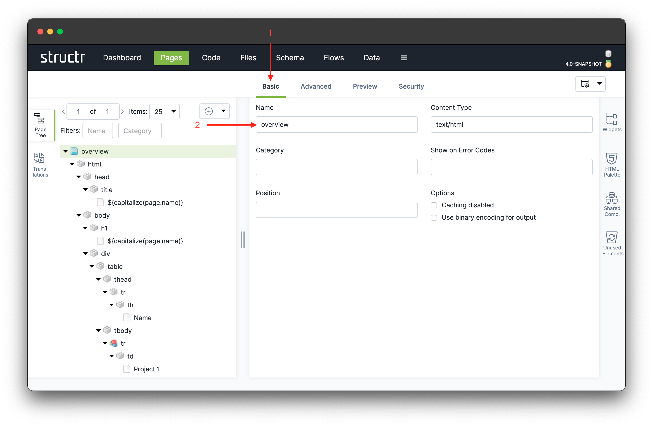
This pattern makes sure that the page’s title is automatically displayed correctly when changing the page’s name. To do so, click on “Basic” or “Advanced” and set the name to “overview” (this page will later be the overview page for projects and tasks). To save the name, we click anywhere outside of the input field. The text field should flash green when the data was successfully updated in the database. The page’s title should now be shown as “Overview”.
Note how the title of the page starts with an uppercase letter, even though its name begins with a lowercase letter. The capitalize() function turns the first character of a string to uppercase.
Add Page Content
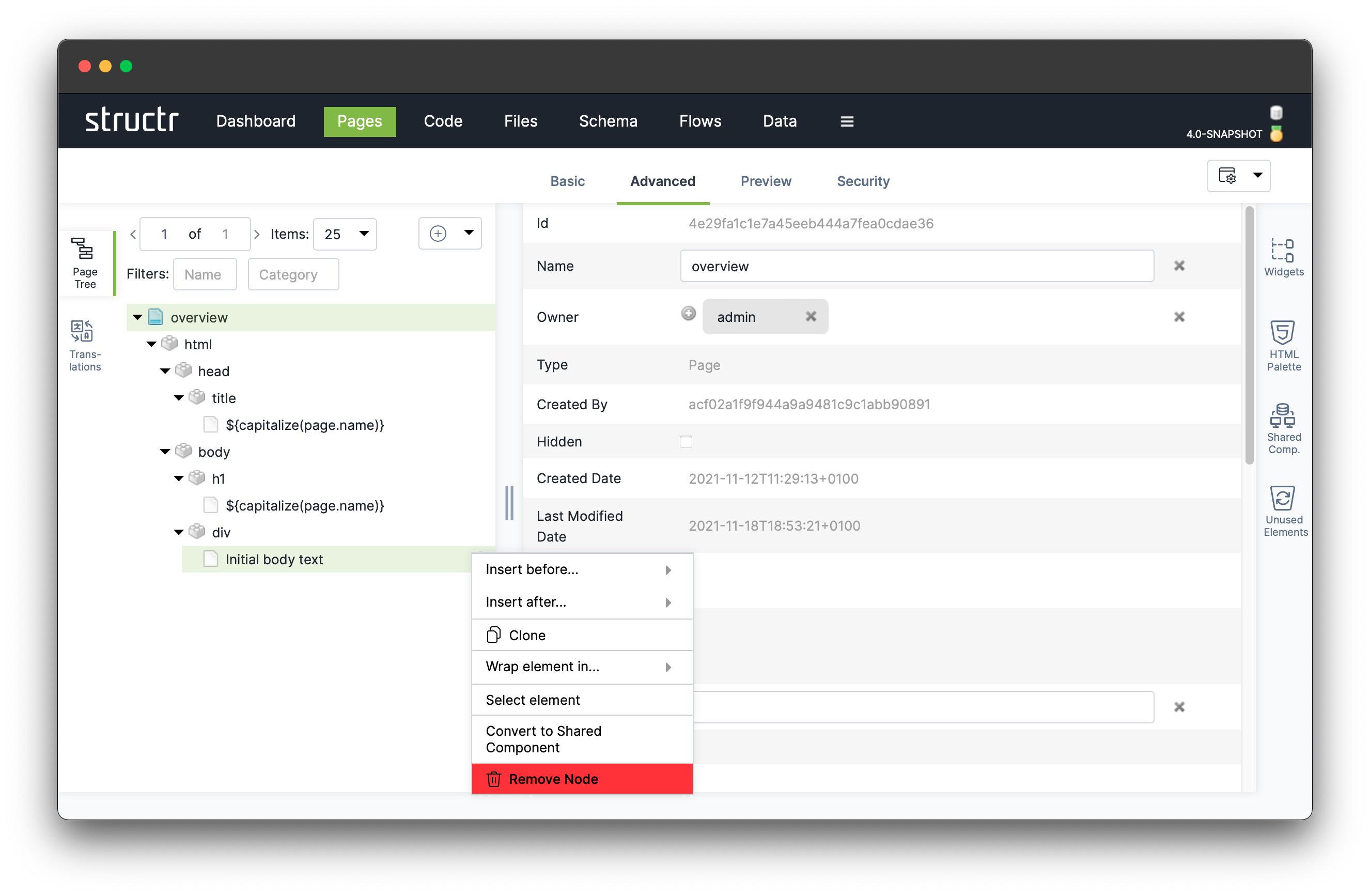
Having set the page’s title, let’s now add some content to the page body element. <body> currently contains a <div> element which contains a content element with the text “Initial body text”.
Note that in this case, the content is not enclosed in the curly braces ${ and } so the text string is rendered into the page unmodified because it’s not interpreted as a scripting expression.
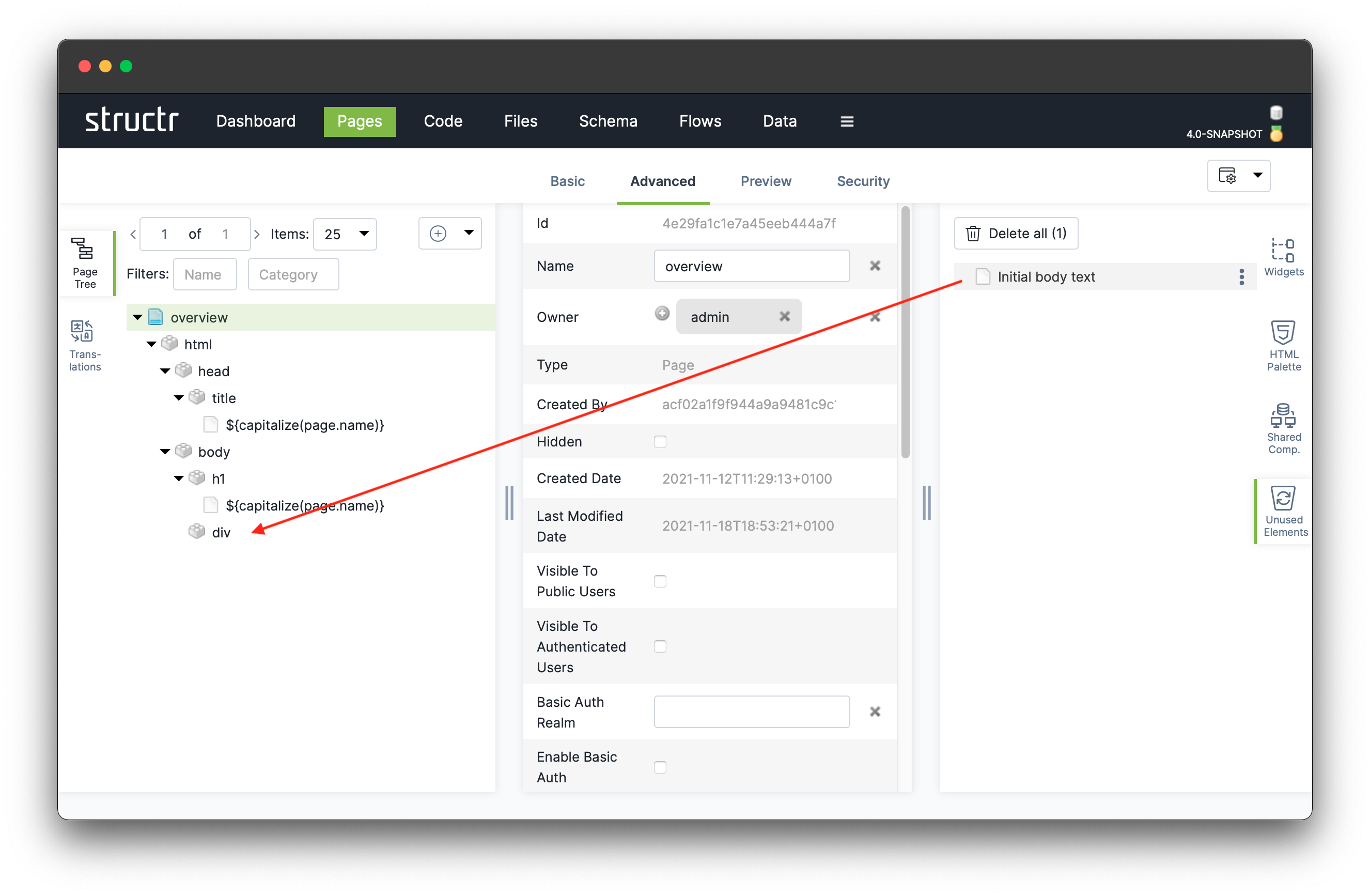
To prepare the <div> element, we have to remove the content element first by selecting “Remove Node” in the context menu (right-click or dots icon).
The remove action can be undone by dragging the removed element back from the Unused Elements area to the desired place in the tree.
Now, let’s create an HTML table to display a simple list of projects. We create this table step by step and start with selecting “Insert HTML element” ⇨ “t” ⇨ “table” on the now empty <div> element to create an empty table.
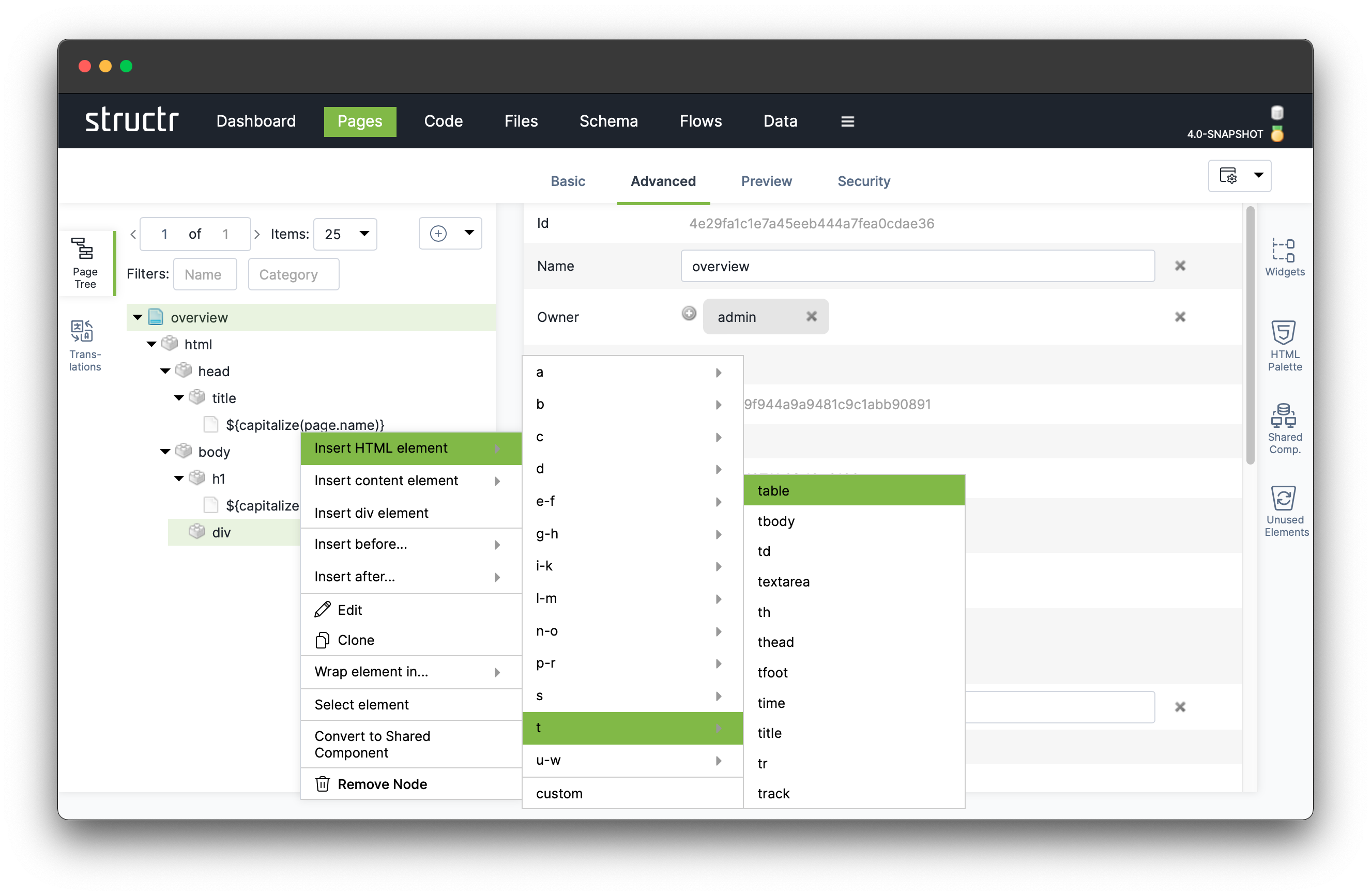
We create the other elements of the table in a similar way. The complete table structure should look as follows:
Simple Data Model
Currently our overview page contains a static table that was handcrafted by us. To populate the page, and in particular the table, with data from our database, we need a data model (also called schema) which describes the type and structure of the information we handle in our application. To do this, we head over to the Schema area by clicking on ( ) in the main menu.
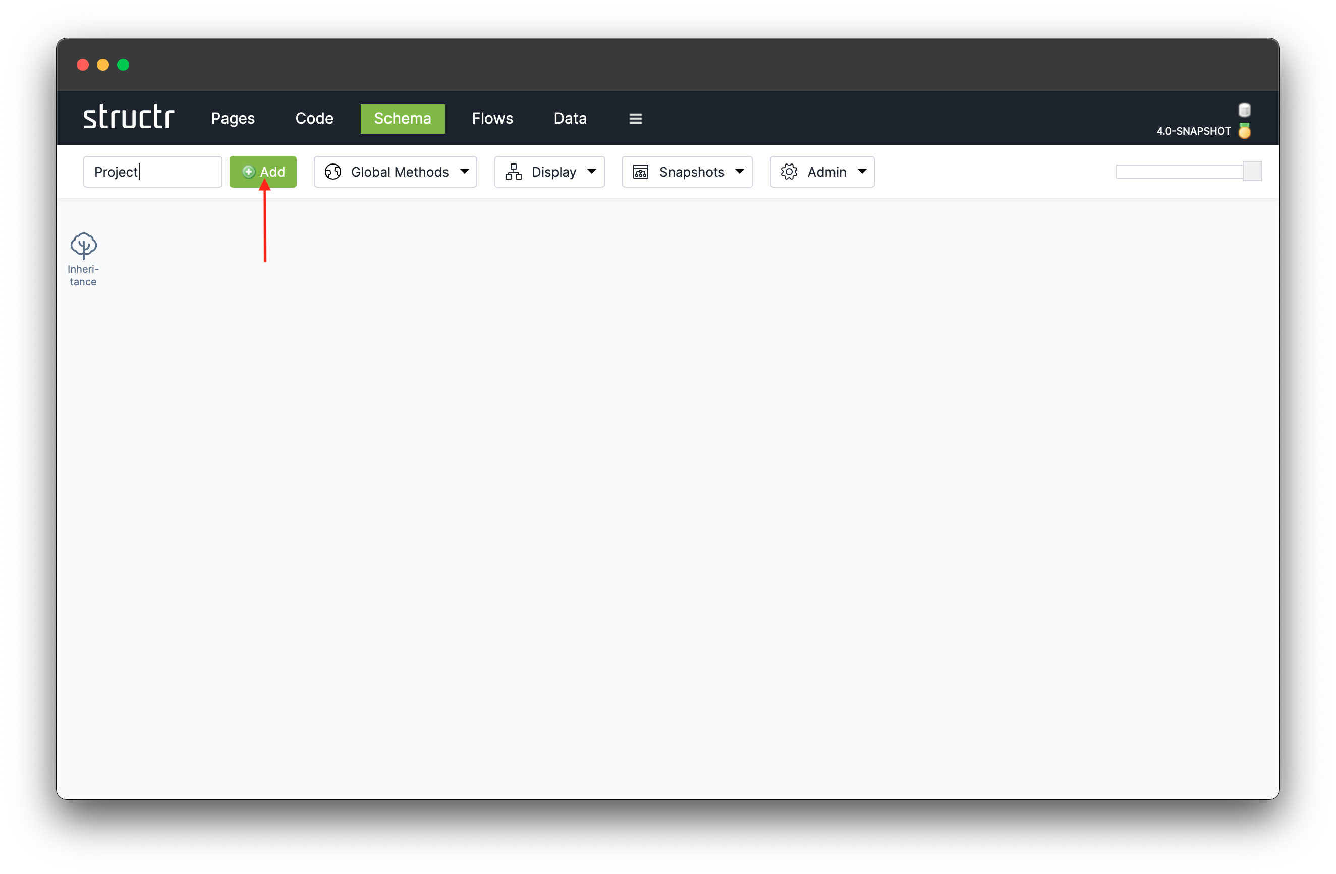
We now create a new datatype Project by typing “Project” into the “New type” field ( ) and hitting the “Add” button (
 ). When done, it takes a couple of seconds for the schema to update.
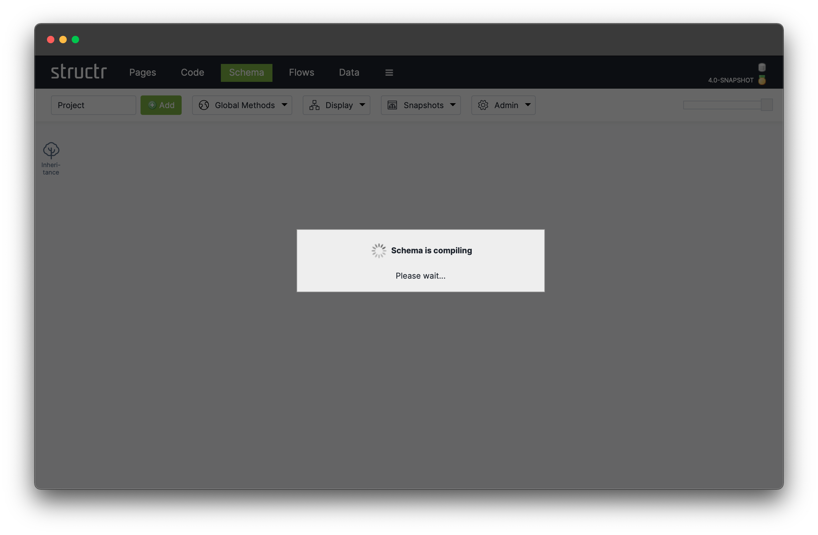
Changing the schema definition, like in this example by creating a new type, triggers a so-called schema recompilation. A message is displayed that blocks the screen and indicates that the schema is being compiled. Under the hood, the definition graph of the data model is modified, source code is generated from it and validated against the existing schema. When the compilation process is finished, the updated schema definition is available in all parts of the entire application without delay and any further deployment steps.
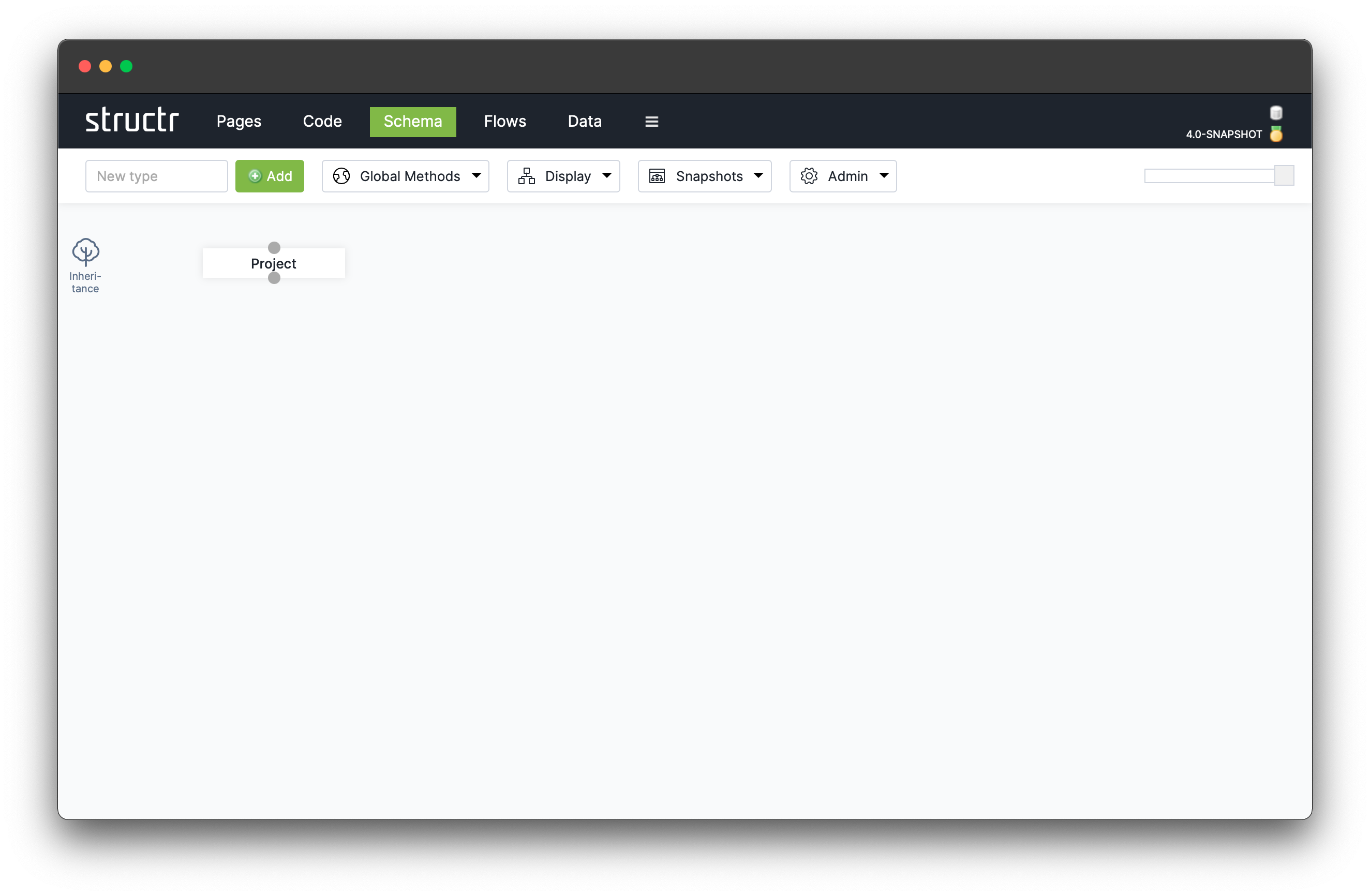
Once the message disappears, the schema has been updated successfully to include the new data type Project. There’s a lot more functionality related to data types, e.g. adding relations between multiple types, adding properties, views, methods etc. that is handled in an entire section down below.
Create Example Data
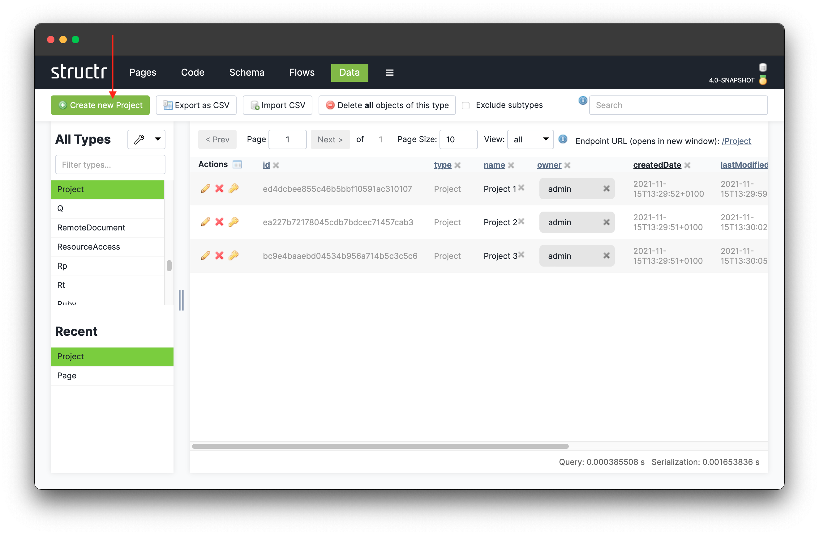
Now that we’ve created our project type, we can create database objects of this type by heading over to the Data area by clicking on  in the main menu. Filter the type list in the left column by entering
 Project to get the list of existing projects (should be empty at the moment). Click on the “Create new Project” button ( ) to create a new project. This creates a new entry in the table. The table lists properties of the new project including some system attributes like an
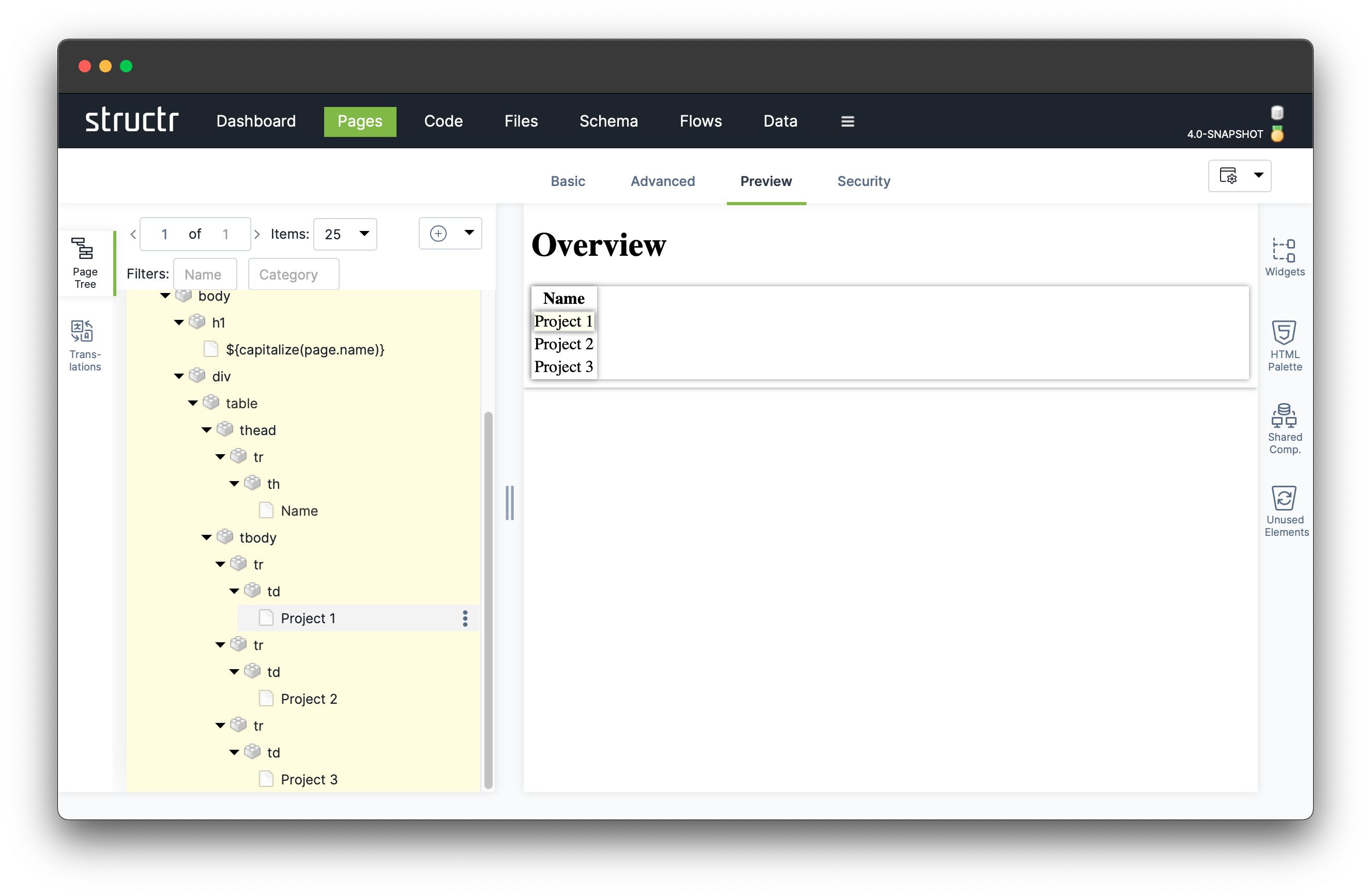
 id, name or owner. For now we will only be using the name property which can be set by clicking into the respective cell in the table and typing in the desired name. We create three projects with the names “Project 1”, “Project 2” and “Project 3”.
Dynamic Content / Repeater
To display the data of database objects instead of static text, we need to change the logic of the table that we built in the previous steps. We can use a so-called repeater element that turns data into HTML markup. In our example, it fetches Project objects from the database and creates a table row for each project of the result list.
A repeater element is a DOM node that is made dynamic by binding a special template expression to it. In particular, we may bind a database query that produces a collection of all elements of type Project to a <row> element. When a repeater element is rendered into the page, the template expression is evaluated and the dom node is rendered into the page for each element in the result.
In our example we use a database query that fetches all objects of the type Project to be displayed with the table row element <tr> inside the table’s body on the overview page. We transform our static into a dynamic table by deleting all <tr> elements from the table’s body except for one which will become our repeater element.
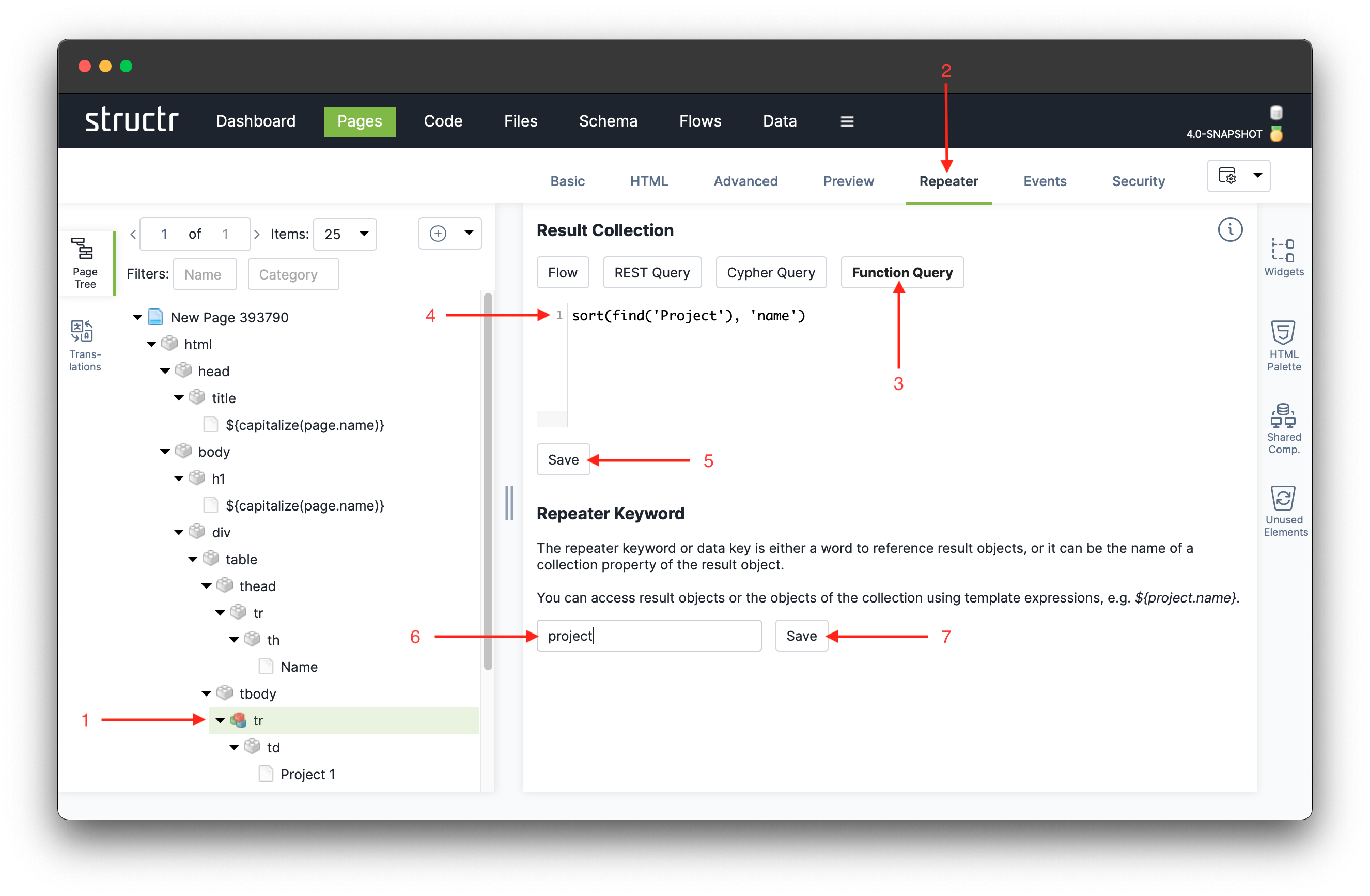
To transform this remaining row into a repeater element, click the <tr> element and “Repeater” in the main tab to configure the repeater options. You can choose one of the following options to retrieve a collection of results from a data source: “Flows”, “REST Queries” and “Function Queries”. In this tutorial, we use a simple function query, so click the “Function Query” button and enter the following expression into the textarea:
find('Project')When done, click the ‘Save’ button to and reload the page by clicking on the “Preview” tab.
The find() function is another Structr built-in function, just like capitalize() we used in the page’s title and heading above. The find() function takes as argument the name of a type and returns a collection of all instances of this type.
Note that the content of the function query is not enclosed in curly braces ${ and } because it’s a so-called auto-script environment where any input is always interpreted as script content because anything else wouldn’t make any sense.
Next, we need to define a keyword that allows us to access each element of the result collection. Just enter “project” and click “Save”.
Note that the icon of the
<tr> in the DOM tree. This is because we turned the <tr> element into a so-called repeater element, i.e. it is repeated for each element of the result collection.
DOM elements that are connected to the database or trigger database actions are called “active elements”. In the page tree, they are marked with a special colorful icon. Structr provides a range of other active elements: Active input elements, dynamic output elements, action buttons and repeater elements. In the following we make use of other active elements.
All the table rows still show the same project name. This is because the content field of the repeater row still only contains the static text “Project 1”. Let’s have each row display the name of a project by using another template expression and use the repeater keyword or data key as follows:
${project.name}Other than the page system keyword, the project keyword has to be explicitly defined by us in repeater configuration of the <tr> element.
The result returned by the find() function is not sorted, so in order to get a sorted project list, we need to add the system function sort() which requires two parameters: A a collection and the name of a property to sort by. Modify the function query of the repeater element as follows:
sort(find('Project'), 'name')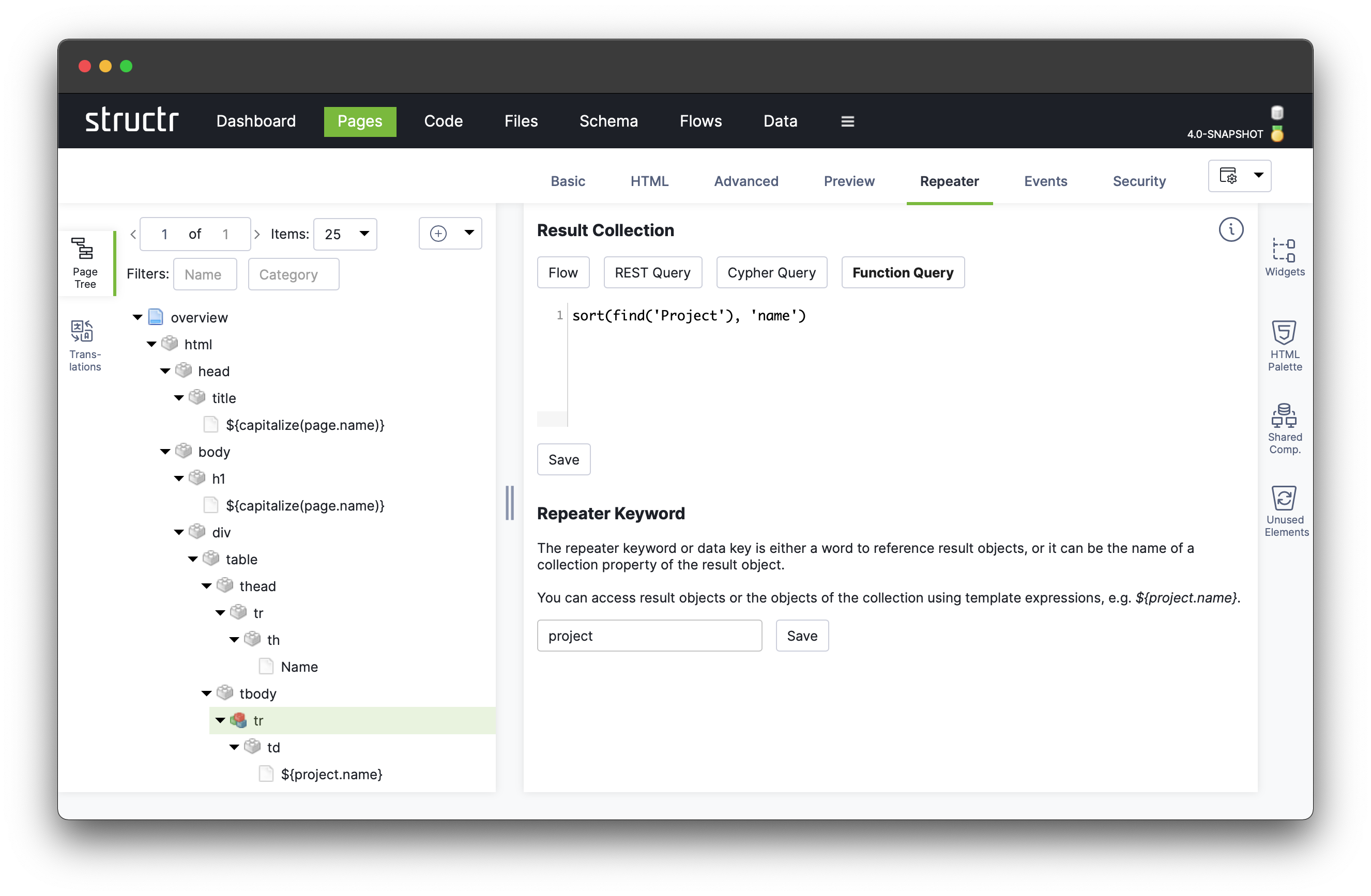
This concludes the development of the most basic functionalities of this simple demo application. The following four sections cover more advanced topics by extending our application in the following ways:
- extending the user interface with imported styles from existing projects,
- adding images to projects via built-in types,
- adding editing functionality to the table and
- extending the data model with tasks and deadlines.
These sections are largely independent of one another, as they only assume the functionality described in this section.
Import Bootstrap Page Template
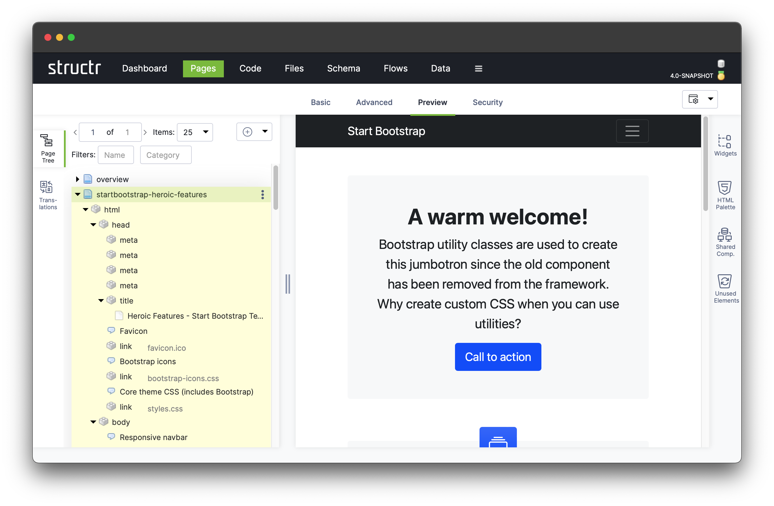
This section is about how to use an existing web page as a template. As a source of examples, we use the Start Bootstrap Templates collection. Since we want to replace the overview page, we choose the Heroic Features page as it features a list-like structure, but in general, any template with clean and semantically correct HTML will do.
Click on “Import page” in the dropdown menu of the Page Tree to open dialog. Now either copy the raw HTML code into textarea or enter the URL of the example page in the text field below the textarea to let the system fetch the page for us.
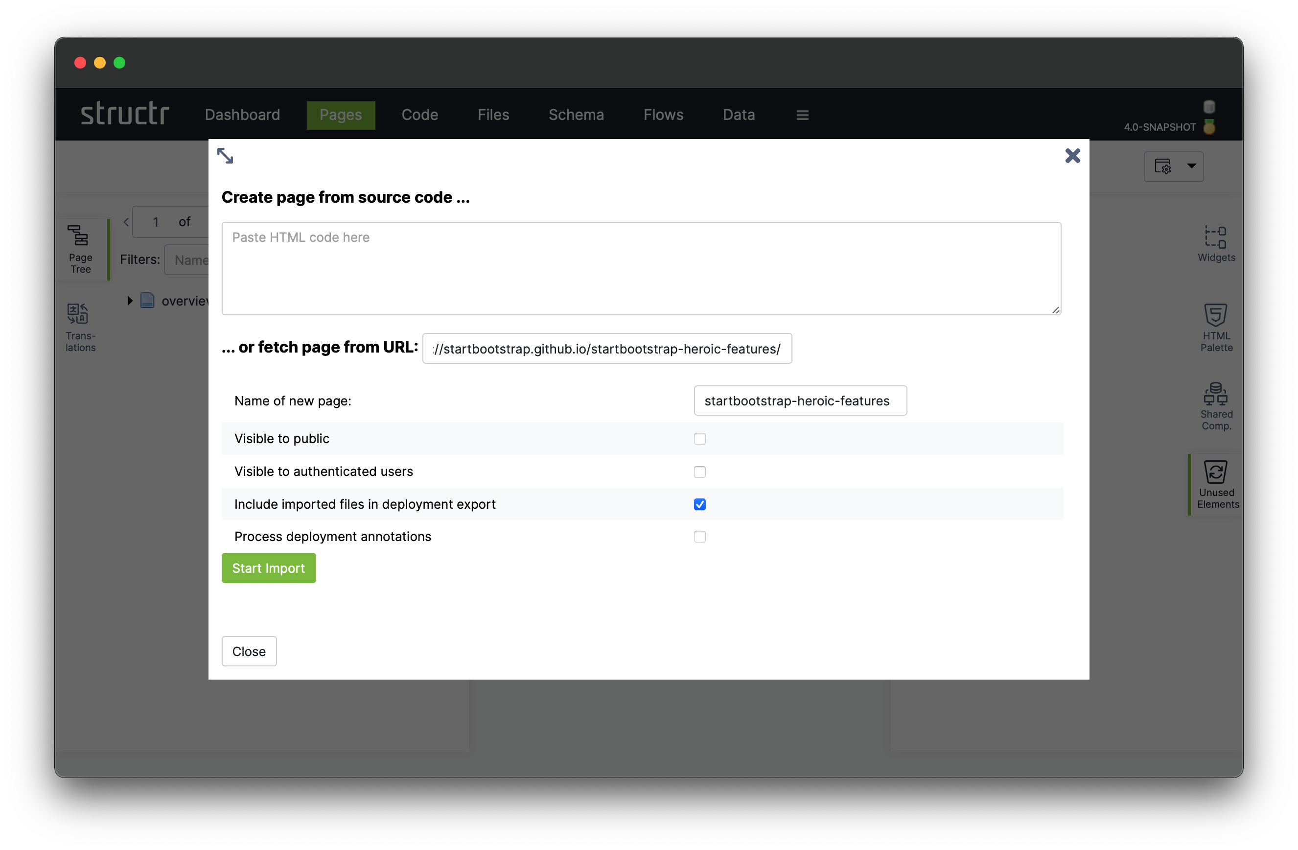
Here, we do the latter and hit the “Start Import” button. Notification messages in the top right corner indicate when the page is successfully parsed and imported. You can close the Import Template dialog at any time, the import process continues in the background. When the import is finished, click on the new page element in the page tree and select Preview to display the imported page.
Shared Components
The imported page is much more complex than the simple overview page we manually created before. For larger pages like this, it is recommended to logically group parts of its HTML structure into reusable elements like the so-called Shared Components that are handled in the following sections.
A shared component is a part of the DOM tree that is shared between multiple pages. For instance a navigation menu is typically a good candidate for a shared component.
Sharing parts of the DOM tree across multiple pages has two main advantages:
-
DRY (Don’t Repeat Yourself) principle: Developing a component only once and include it anywhere needed saves time. Also, any changes are only done in the shared component and are automatically effective on all affected pages.
-
Modularity: You can logically group parts of a page that are responsible for a specific part, such as e.g. the navigation or specific visual elements such as a card.
The overview page has three main components that make up the page’s body: The top navigation bar, the actual content, and the footer. Let’s convert the top navigation menu and the footer into shared components.
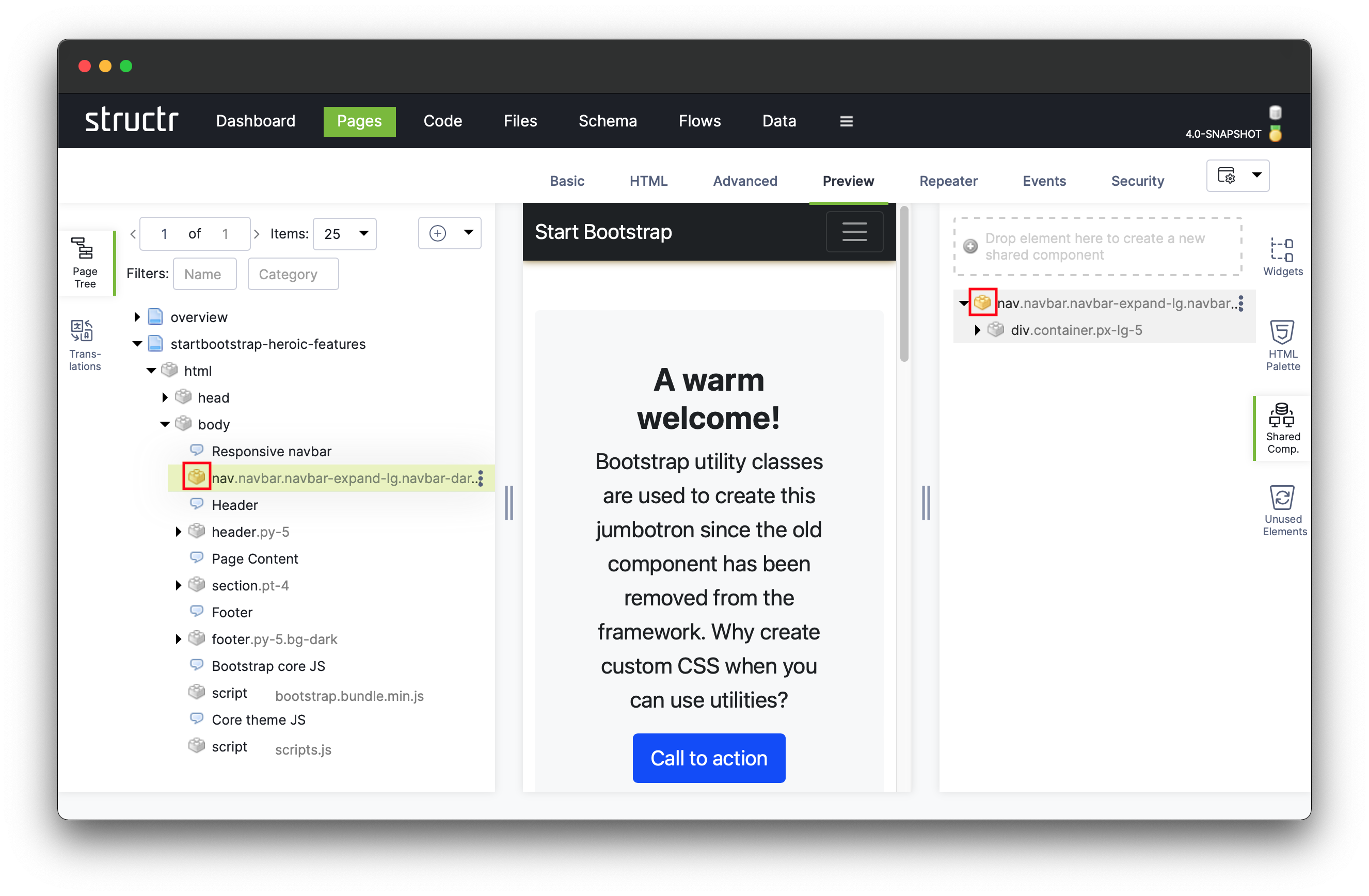
All shared components of a Structr project are listed under the “Shared Components” fly-out on the right hand side in the Pages area. Open the shared components fly-out and drag the navigation element (<nav>) into the drop zone at the top of the shared components area.
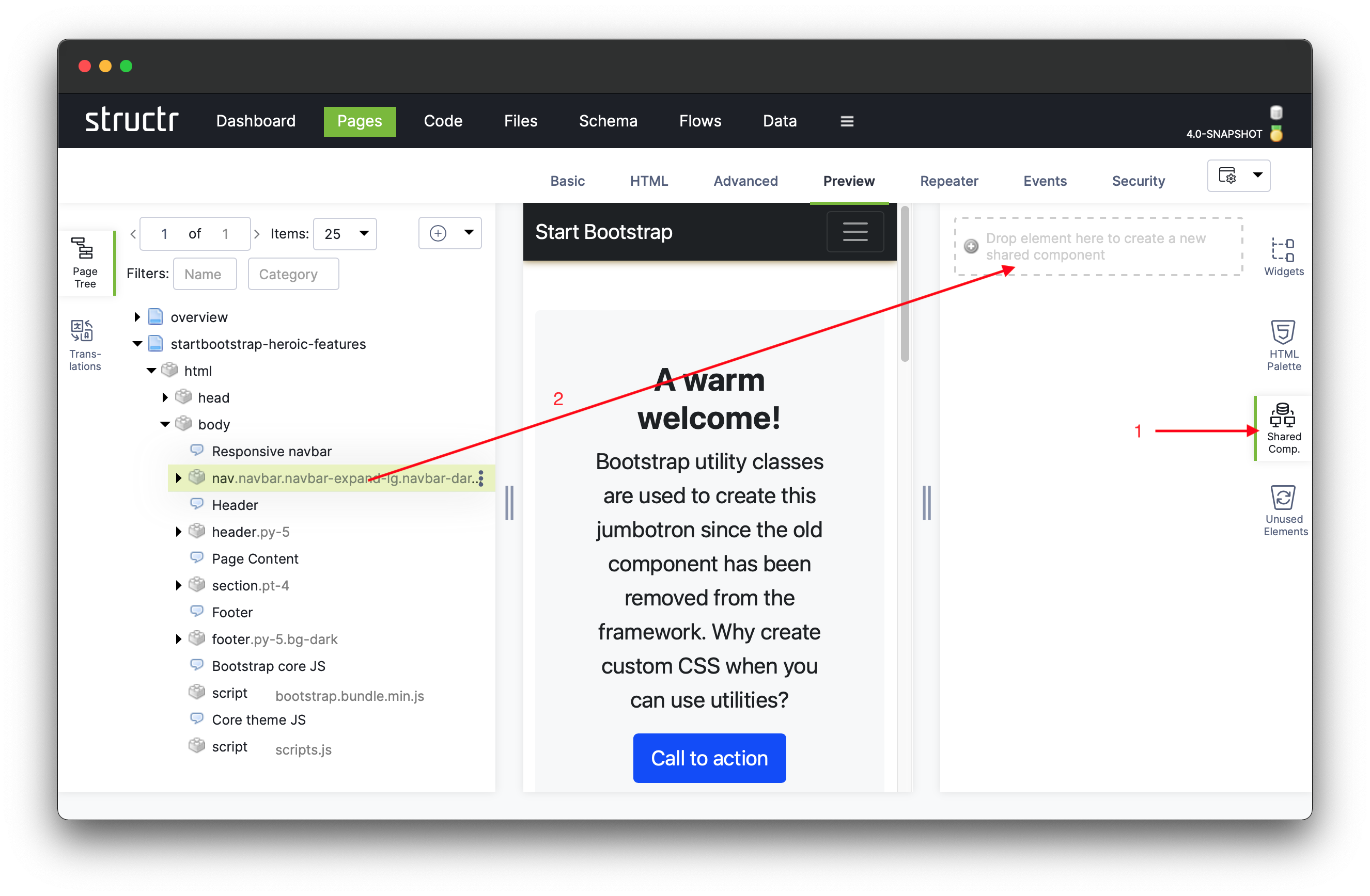
Note how the icon of the <nav> element changes from  to
to  . Shared components in the fly-out on the right that are linked to one or more pages, have the same icon while shared components that are not used on any page still have the regular icon .
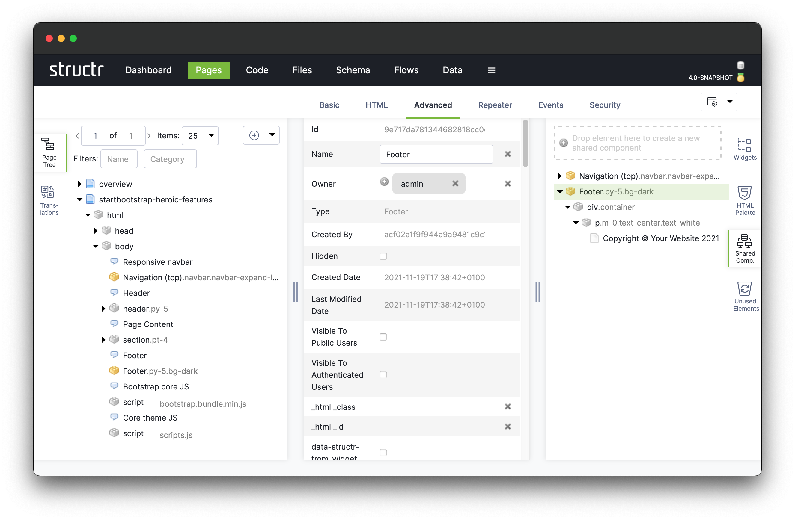
Let’s change the name of the shared component we created. Click on “Advanced” and set the name to “Navigation (top)”. See how the name changes in the shared component area and in the page tree simultaneously.
Repeat the above steps for the page’s footer and rename the shared component to “Footer”.
Notice that the page output doesn’t change at all when moving regular DOM elements to shared components, allowing to change implementation details without affecting the end-user experience of the application.
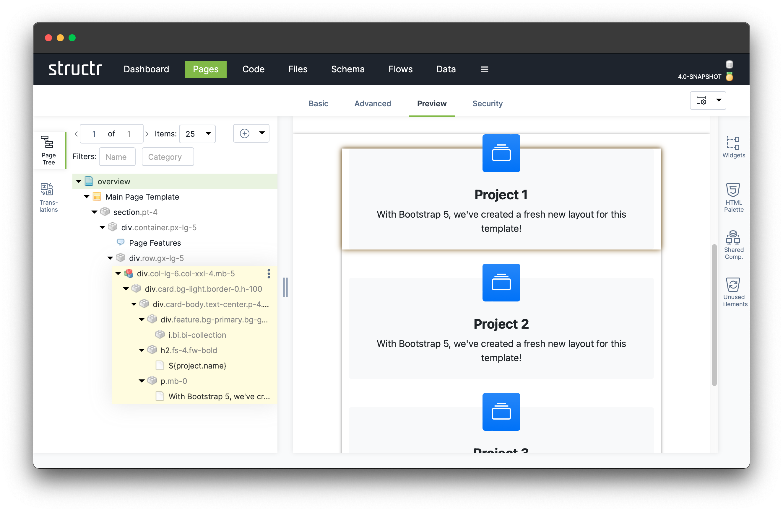
Now the page’s structure is already a lot more manageable than before. Next, let’s remove all but one card from the page body. Similar to the table-based overview page we created before, we use a repeater element to render all projects as cards instead of table rows.
We may have to select the parent or child node in the DOM tree to locate the right element. Hovering over the elements in the DOM tree highlights the respective elements in the preview, helping us locate the correct DOM element.
Once we have found the first card we remove all cards except for the last one, by repeatedly clicking on the Remove node menu entry.
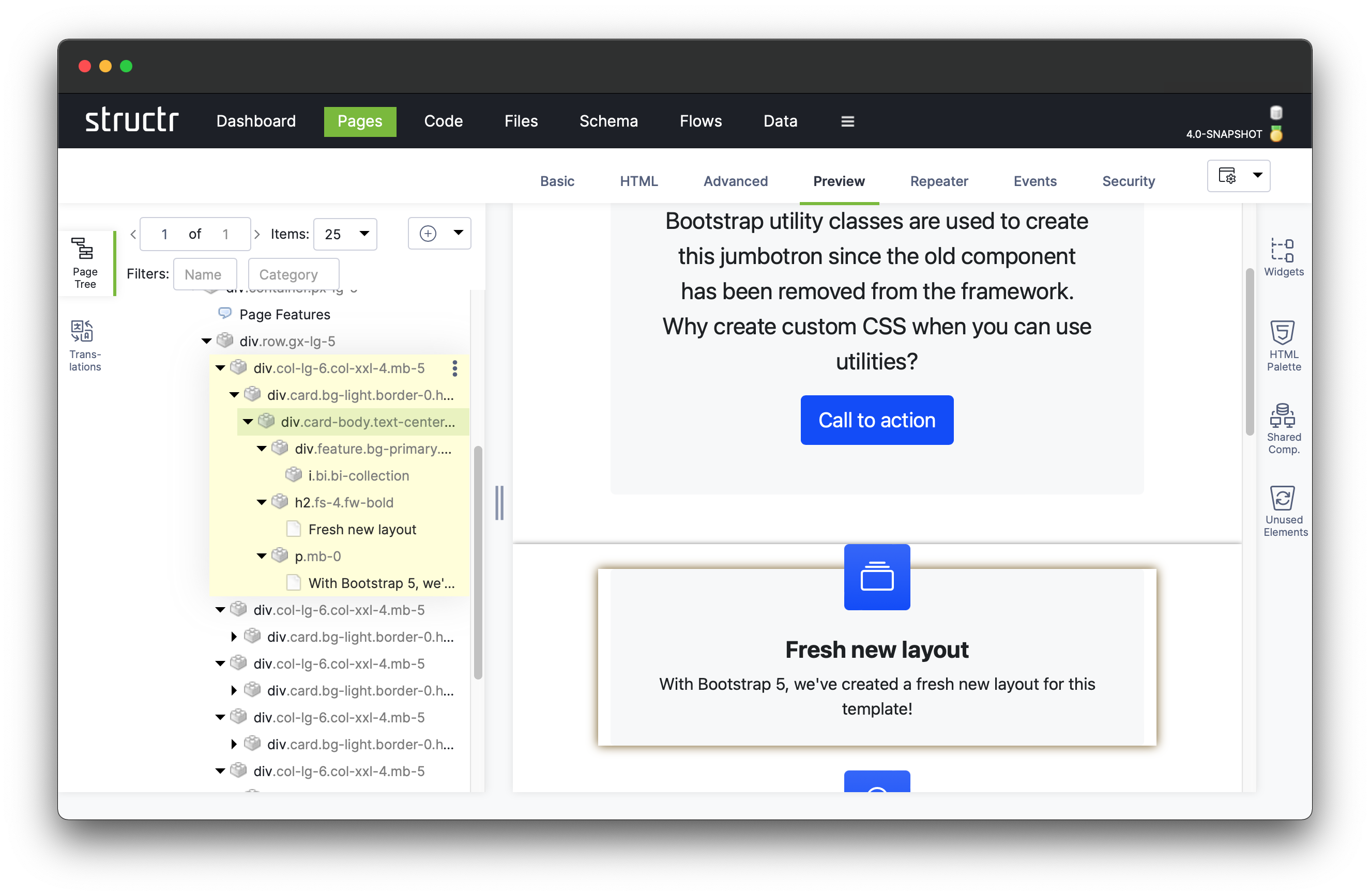
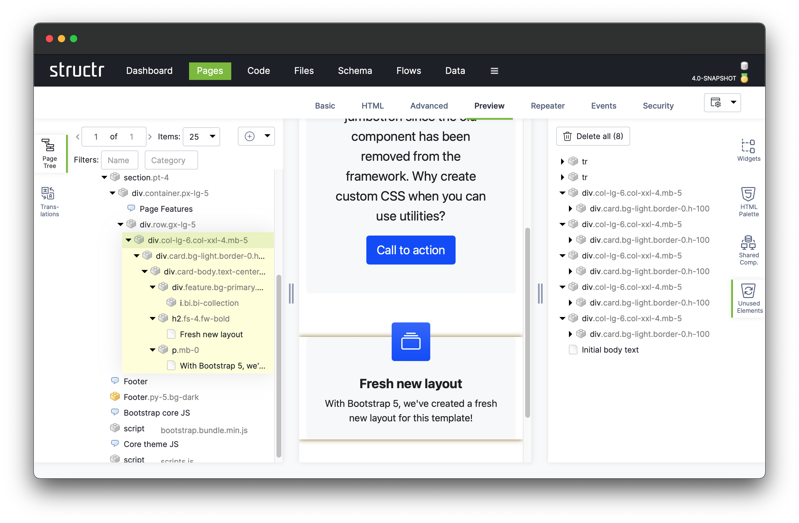
We turn the remaining card into a repeater element like we did with the <tr> element before. Click on the element with the CSS selector .col-lg-6.col-xxl-4.mb-5, click on Repeater, then Function Query and enter the following expression into the text area:
sort(find('Project'), 'name')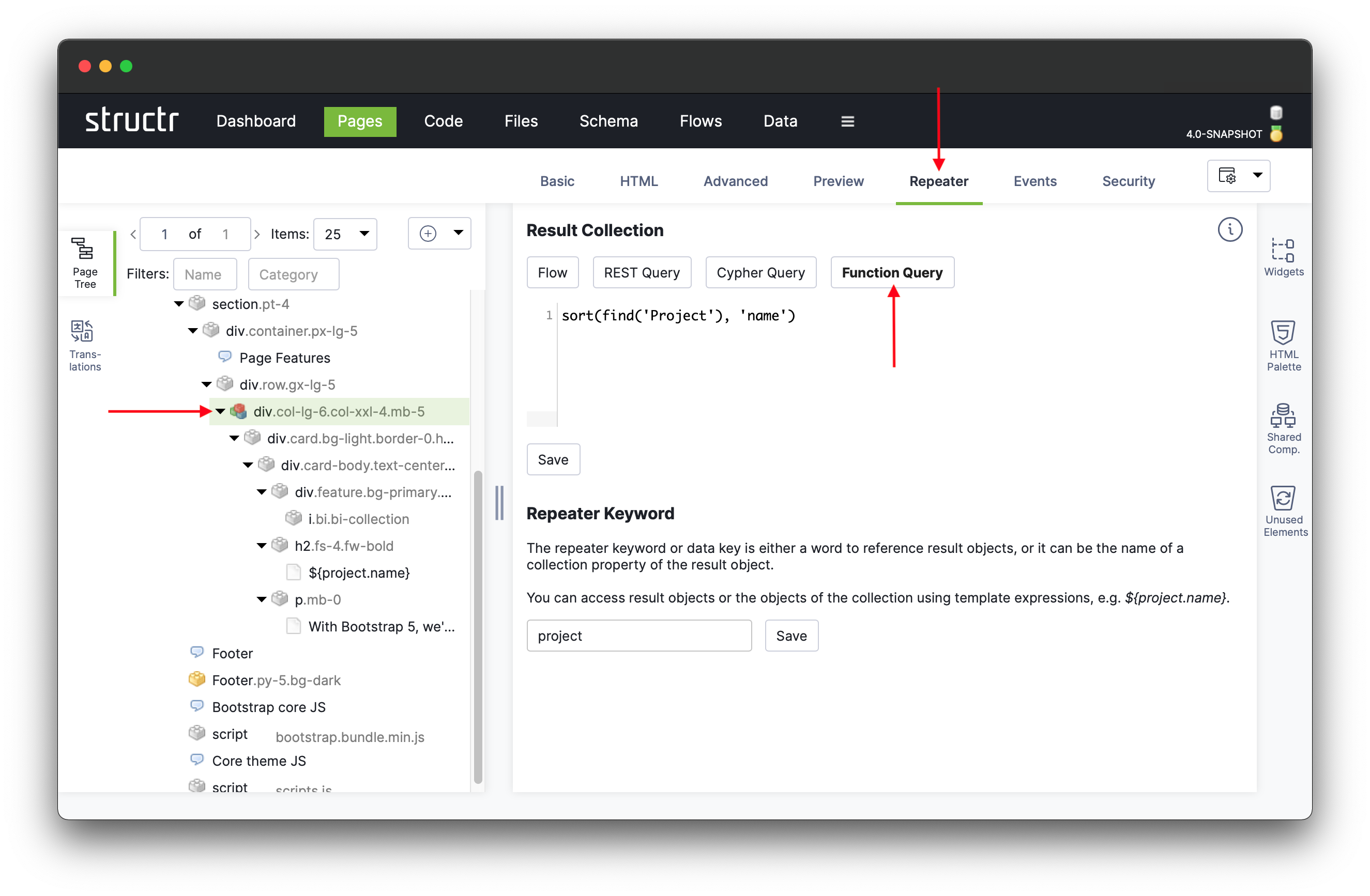
Finally, we set the Data Key to “project”, save the repeater configuration and close the properties dialog. Apart from the DOM element to which this repeater configuration is bound, it is identical to the one specified in the base application.
We can now change the card’s title to the name of the project. To do so, click on Editor and replace the static text “Fresh new layout” by the expression
${project.name}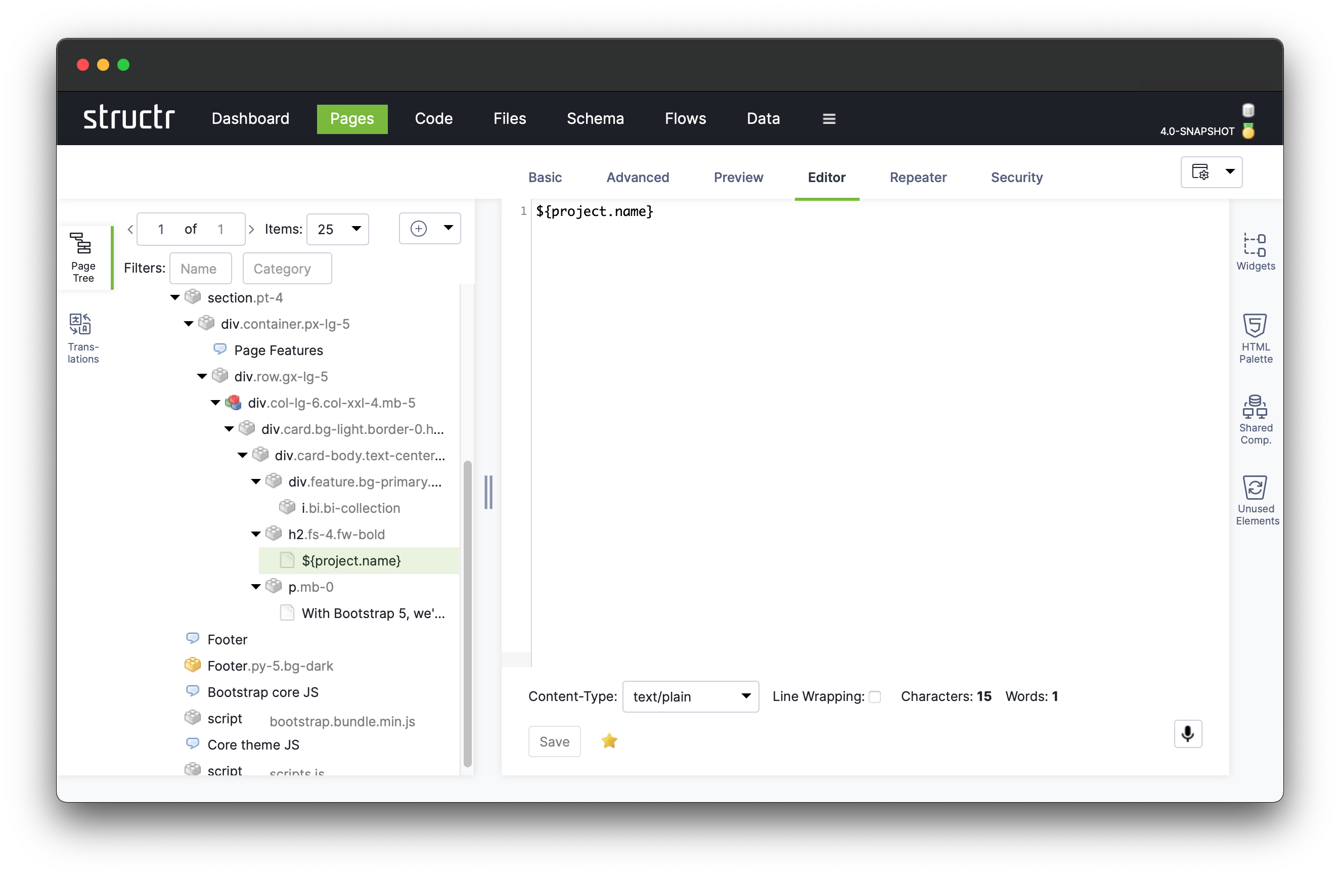
Templates
To simplify the page’s structure further, we will now introduce a template element that allows us to
-
encapsulate the page’s administrative elements such as the navigation and the footer, and
-
to create a generic frame to create several different pages from with the same look and feel but different content.
We start by introducing the template element. In Structr, templates are special elements that may be inserted into a page’s DOM tree at any position. Much like a content element, a template element has a body which is rendered into the page. However, in contrast to the content element, a template element may have children in the DOM tree, which will become important later on.
Create a new page and remove the entire content of the page by deleting the <html> node at the root of the page. Then add a new template element as the only child of the page element.
We replace the template’s initial placeholder text #template with the HTML source code of the page we created before. Open the startbootstrap-heroic-features page in source mode and copy the HTML code into the template element. Finally, set the content type of the template element to text/html to enable the correct escaping.
In the preview, the template-based page should now look identical to our previous overview page.
The template in it’s current form is not particularly useful for two reasons: Firstly, it’s redundant, since it contains the HTML structure of the navigation menu and footer which are already shared components, and secondly, it creates an entirely static page which defeats the purpose of the repeater elements we used in our page created before.
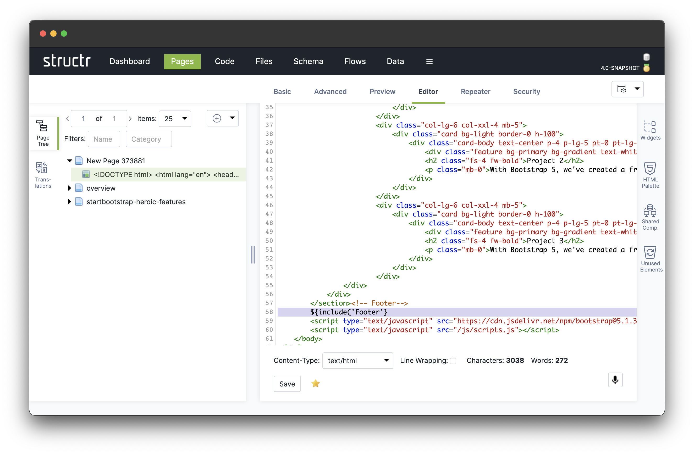
We can address the first issue by replacing the HTML code of the navigation bar and the footer by expressions that render the respective shared components into the page instead by using the include() system function. This function takes the name of the element as argument a name.
Thus we can replace the HTML code for the navigation bar
<nav>
  ...
</nav>
by the following expression:
${include('Navigation (top)')}Replace the HTML code for the footer by the expression ${include('Footer') as well.
To allow the template-based page also to have dynamic content, we replace the entire HTML content between the navigation bar and footer from the template and instead clone the tree structure of our old overview page into the new page.
Other than content elements, template elements can have child elements in the DOM tree which makes them very flexible. There are two special template expressions that help organizing the content rendering hierarchy: render() and include_child().
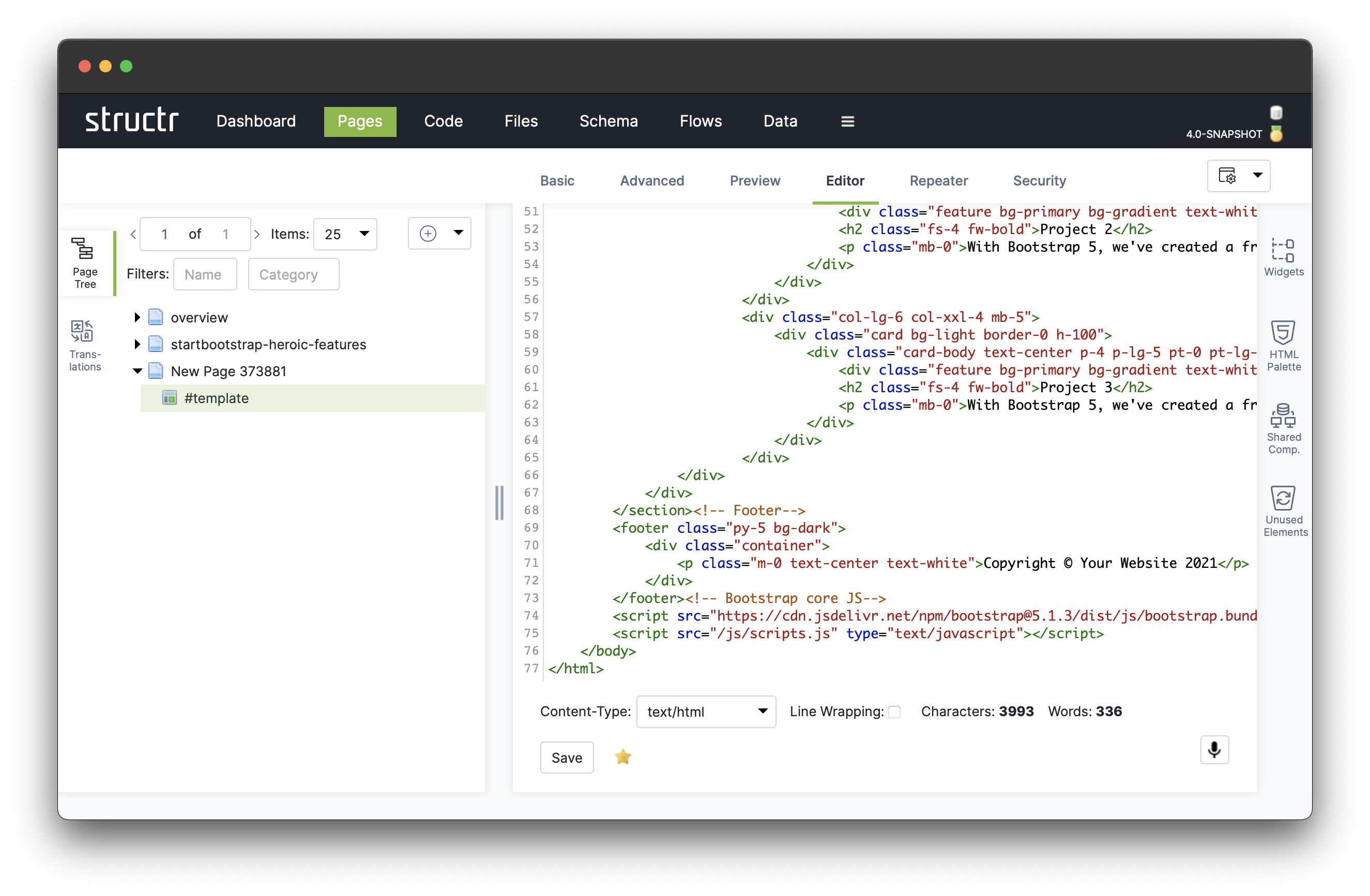
In our case we only have a single child element and we know exactly where to render it, namely between the header element and the footer element, so we just replace the static content
<!-- Page Content-->
<section class="pt-4">
  ...
</section>
by the following expression:
<!-- Page Content-->
${render(children)}
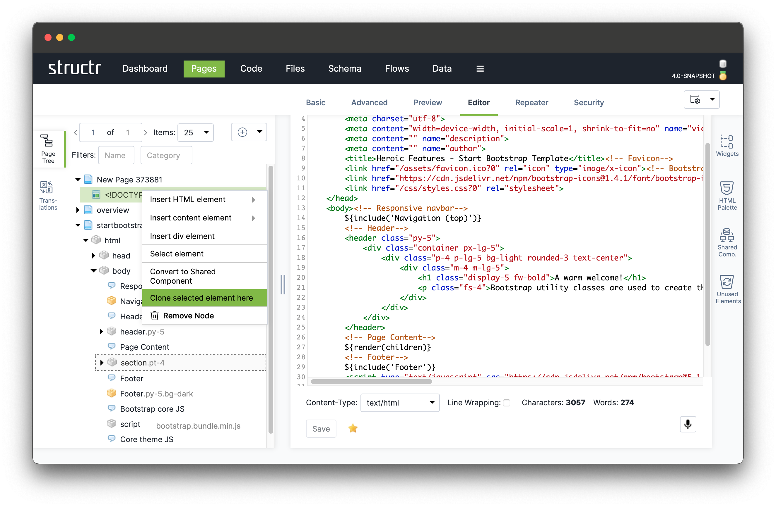
Next, select the container element to be cloned from the startbootstrap-heroic-features page by navigating to the section element and click on “Select element” in the menu.
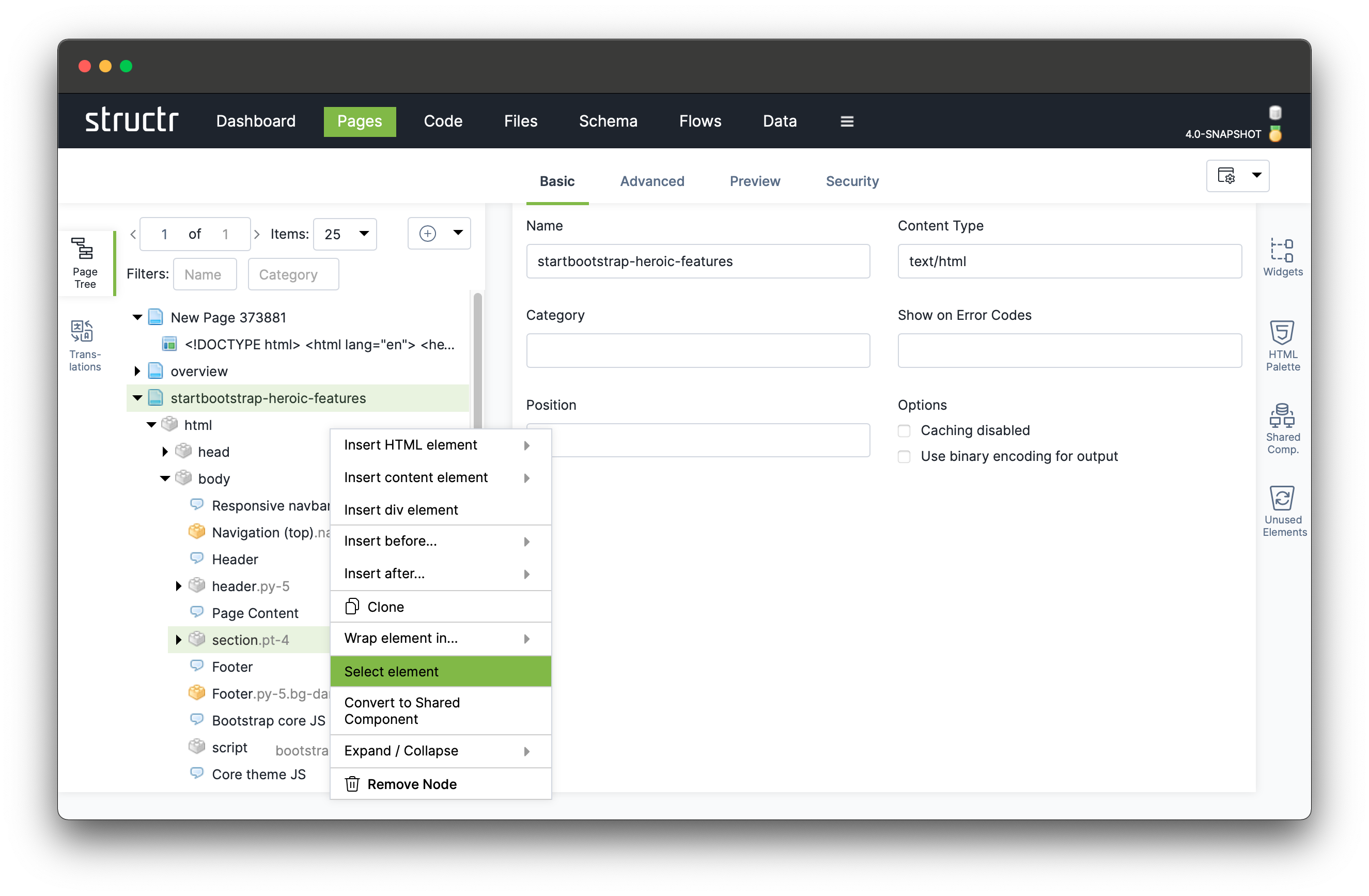
After that, navigate to the template element that displays as <!DOCTYPE html>... and click on “Clone selected element here”. This clones the entire DOM branch with the section element as root into our new page.
Finally, we create a shared component out of this template element. This allows us to include the template into every new page we create within this project, creating a skeleton for new pages that include the top navigation menu and the footer. Due to the render(<a data-id="3230f1d81eb345c199024b82eb7c56f2" class="mention">children</a>) expression in the template body, the individual content of each new page can then be added as a child of the template in the DOM tree, allowing us to quickly create pages with the same main theme but different content.
Start by setting the template’s name to “Main Page Template”. Next, drag the template element onto the drop zone in the shared components fly-out.
The icon of the template changes from a regular template element ( ) to that of a shared template element (
 ).
).
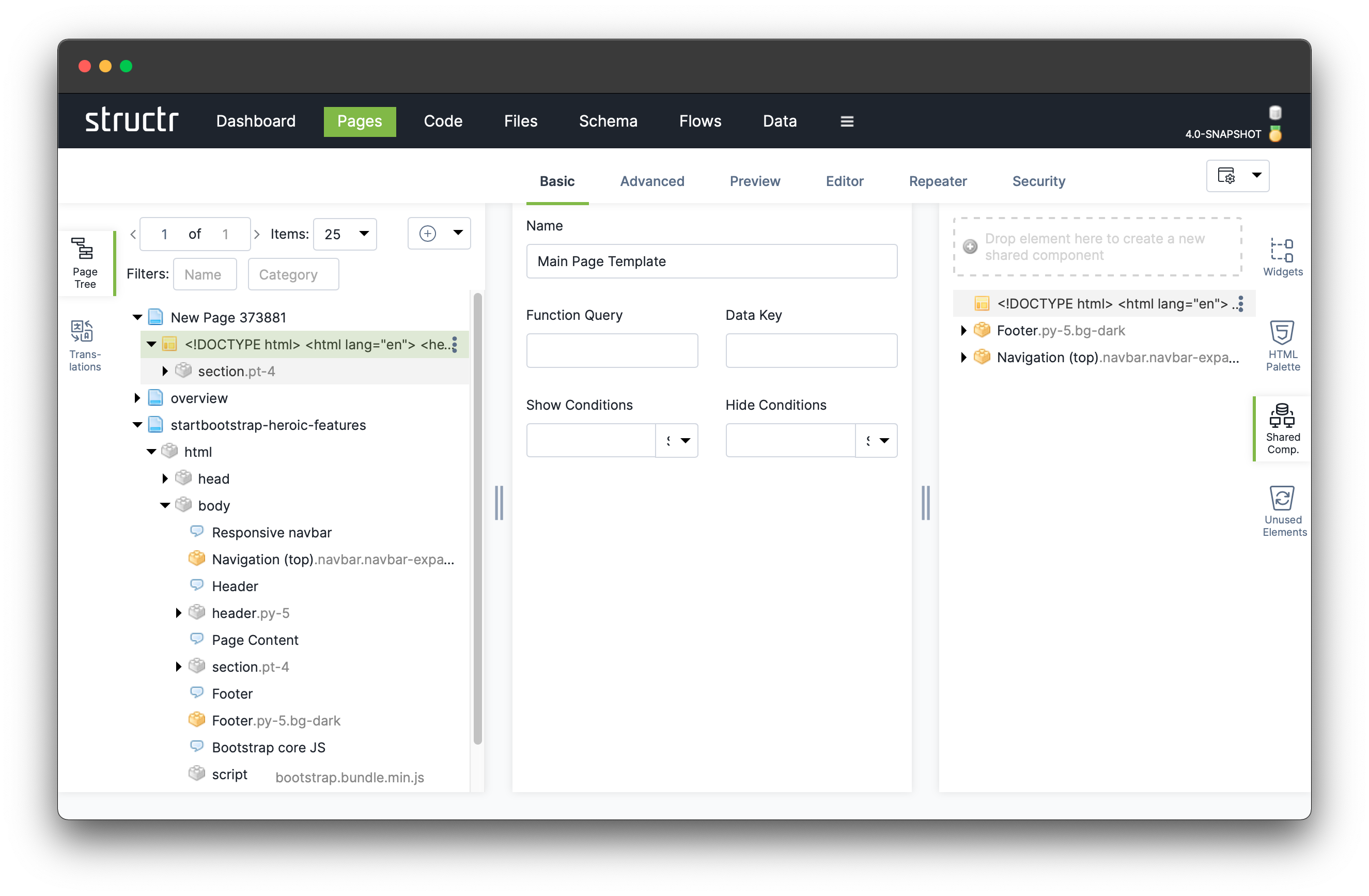
Finally, we remove the other two overview pages, since we won’t be needing them anymore, and rename our remaining page appropriately.
With this simplified page structure in place, you can now play around by changing the content of the individual components to better suit your requirements.