The Pages sectionPages
The Pages section provides a visual web application builder to manage the HTML pages that form the user interface of a Structr application. It consists of a central preview area that shows the rendered page, and a number of fly-outs on both sides with additional functions and information. The flyouts are closed by default, and can be opened by clicking on the handle.
The Pages section is one of the most important areas of the Structr UI, because it is the place where you build the frontend of a Structr application. It allows you to manage Structr pages, import Templates and Widgets, manage Shared Components, edit static content, templates or linked files, and more.
For advanced users, there are many options to precisely control the security and visibility of pages and individual elements, how to handle HTTP errors like 404 (Not Found) or 403 (Forbidden) in your application, etc. Like all other built-in types in Structr, Pages and other HTML elements can be extended with custom properties, relationships to other types, and even inherited from, to allow a very tight integration in your application.
Preview Area
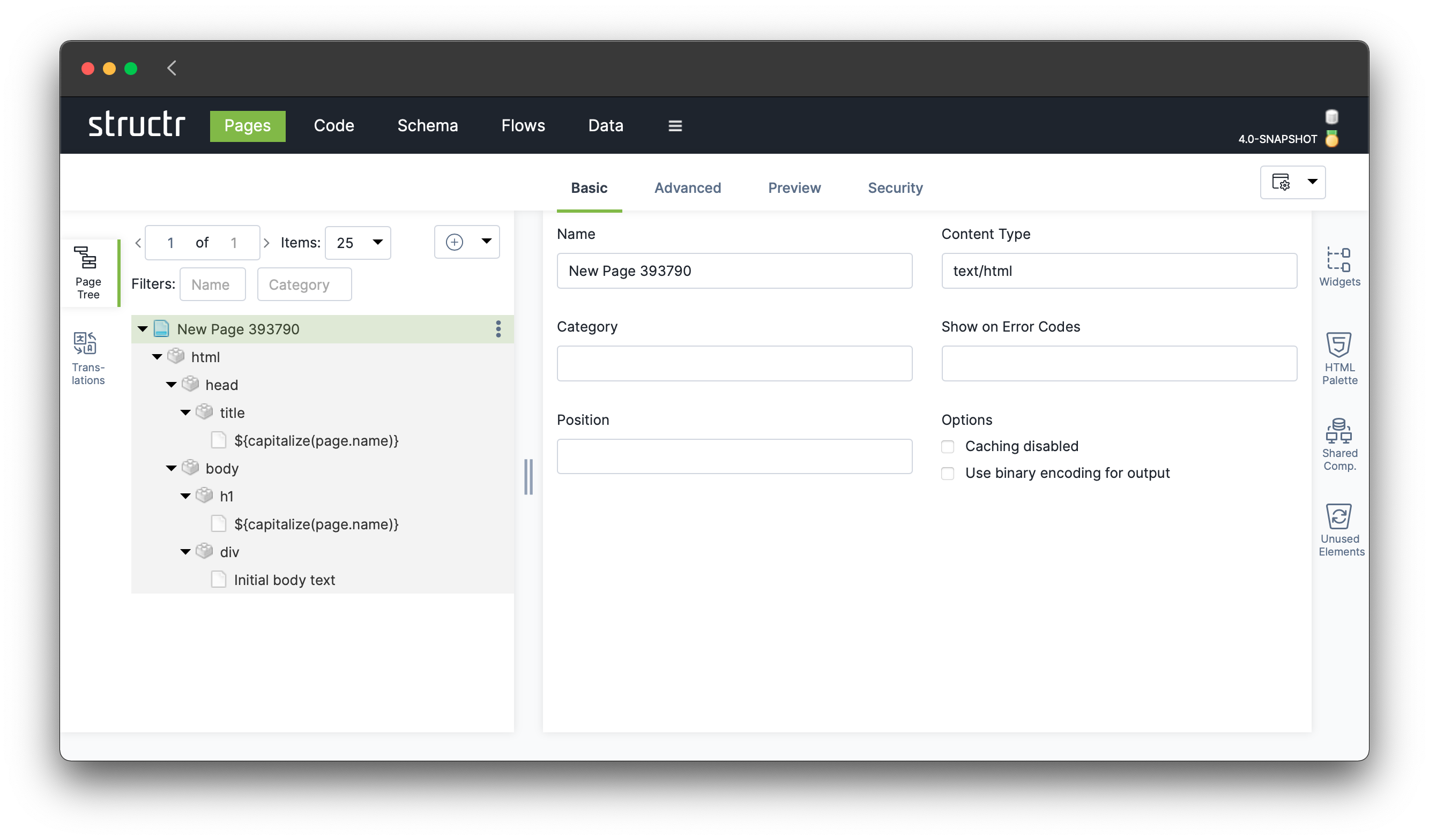
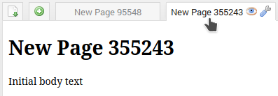
The preview area shows the rendered HTML content of the selected page. Hovering over an element in the rendered page highlights the corresponding element in the Page Tree, and vice-versa. The preview allows inline editing of text content when clicking on the text, which is why the preview area shows the string --- empty --- for empty elements.
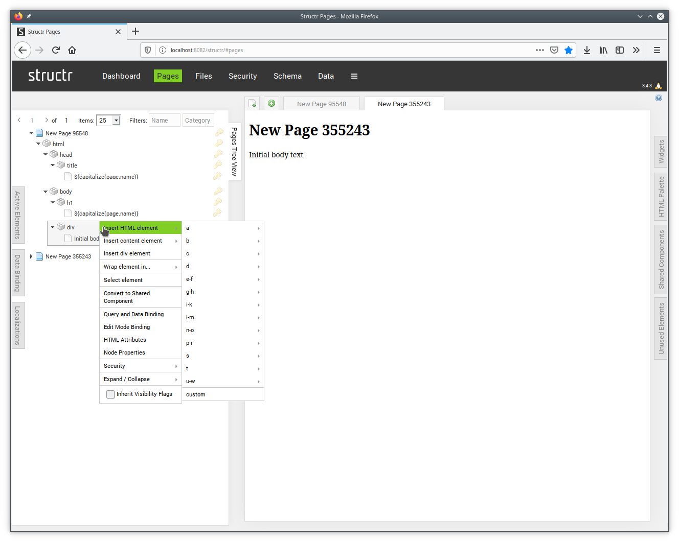
It has a header row with two buttons, and a tab for each page. The Import Template button ( ) opens an import dialog that allows you to create a new page, either from HTML code, or by importing a web page from an URL. The Add button (
 ) creates a simple page with some initial elements, as shown in the above screenshot.
Clicking on an inactive tab selects the corresponding page, so that the content of that page shows up in the preview area. Clicking on an active tab allows you to change the name of the page, while hovering over a tab shows two additional icons. The View button ( ) opens the corresponding page in a new browser tab, and the Settings button (
 ) opens a configuration dialog for the page preview.
Buttons
| | Open Import Template Dialog |
| | Create a simple page |
| | Open page in new window |
| | Open Edit Page Settings Dialog |
Flyouts on the left side
Pages Tree View
The Pages Tree View is the main interface for editing Structr pages. It shows a filterable, pageable list of all pages in the database and allows browsing and editing of the underlying node structure. At the root level, a page is represented by the page icon ( ) and the name of the page next to it. The name can be changed by clicking on it.
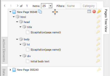
Below the page element will usually be an <html> element with the well-known HTML structure, or a Template element with static HTML content. You can add new elements using the right-click context menu, and move or sort the elements in a subtree by dragging and dropping them around.
When you hover over an element in the page tree, buttons for the most common actions become visible, i.e. the Edit Properties button ( ), the Delete button (
 ) and the Access Control button (
 ).
).
Context Menu
Right-clicking on an element in the page tree opens the content menu, which provides menu items for inserting new HTML elements, wrapping an element in an enclosing block element, opening the different dialogs, and much more.
Icons
The icon of an element in a page corresponds to its type and its function. The following table shows all element icons that are used in the Page Tree.
| Icon | Element type |
|---|---|
| Page |
 | Block element |
 | Repeater |
 | Shared Component |
 | Content element |
 | Template |
 | Shared Template |
Buttons
| Icon | Action |
|---|---|
 | Clone element and all its children |
| Open Properties dialog |
| Delete element and all its children |
 | Remove element and all its children |
| Open Access Control and Visibility Dialog |
 | Open Edit Content Dialog |
 | Open Edit Link Dialog |
If you accidentially remove an element, it is not deleted immediately. Instead, it ends up in the Unused Elements flyout from where you can drag and drop it back into the page.
Active Elements
The Active Elements flyout shows the list of active elements in the current page, i.e. all elements that have dynamic behaviour, like Repeaters, elements with show conditions or hide conditions, and the corresponding content elements that output dynamic content.
The use of the active elements flyout and its functionality is not recommended, it is deprecated and will be removed in a future release.
Data Binding
The Data Binding flyout provides functionality to create repeater elements via drag-and-drop. After selecting a type, you can drop a special element into the page preview to create a repeater element for the corresponding type. Or you can drop one of the property elements shown in the flyout to replace the text of a content element with a template expression that references the corresponding property.
The use of the data binding flyout and its functionality is not recommended, it is deprecated and will be removed in a future release.
Localizations
The Localizations flyout allows you to load all localizations for the given locale on the current page (including the UUID of the details object which is also used for the preview).
A localization is an expression that is included in the content of a page or any other textual element in the following form:
localize(key, domain)
Here, key is a term describing the concept that should be rendered depending on the locale which is currently active for the accessing user, and domain describes the context for this term. The combination of key and domain has to be unique.
The retrieval process works just as rendering the page. If you request the locale en_US you might get localizations for en as a fallback if no exact match is found. If no localization could be found, an empty input field is rendered where you can quickly create the missing localization.
Flyouts on the right side
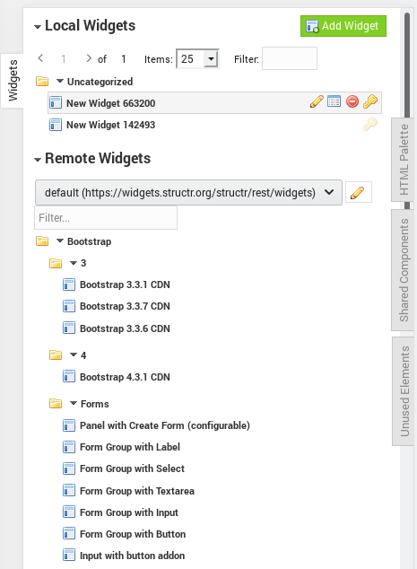
Widgets
The Widgets flyout is the place where local and remote widgets can be managed and accessed. It is divided into two sections, one for local widgets and one for remote widgets.
You can insert a Widget into a page by dragging the Widget element from the Widgets flyout over the desired position in the page tree, and drop it there. If the Widget has configuration options, the Configure Widget Dialog will pop up, otherwise it will be inserted into the page immediately.
Local Widgets
The Local Widgets sections allows you to manage the Widgets that are stored on the local Structr instance. You can browse the list of existing Widgets, add new Widgets, and edit them using the Edit Widget dialog.
Grouping
The Widgets in the Widgets flyout are arranged in a tree-like fashion based on the value of a special property called treePath. The tree path of a Widget is composed of names separated by the / character. For example, if you want to sort you local Widgets into two different groups, say “User Widgets” and “General Widgets”, you can do so by setting the value of the treePath property of each widget to either “/User Widgets” or “/General Widgets”.
When you click the Add Widget button ( ), a new local Widget will be created, given a default name, and added to the “Uncategorized” collection. You can then hover over the Widget element in the list and click the Edit button () to open the Edit Widget dialog. The Edit Properties button (), Delete button () and Access Control button () work just like everywhere else in the Structr User Interface.
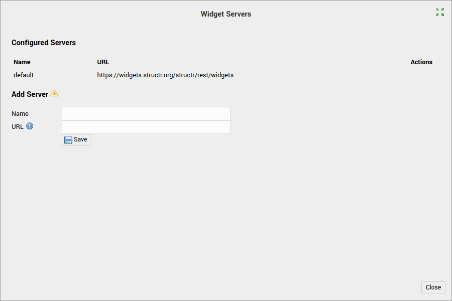
You can make local widgets available to other Structr instances by making them visible to public users, and enter your Widget server’s URL in the Widget Servers dialog on that instance.
Remote Widgets
The Remote Widgets section allows you to select a Widget server from a list of servers, and shows all Widgets that are available on the selected server. Clicking on the Edit button () next to the select box opens the Widget Servers dialog where you can manage the list of remote widget servers.

Remote Widgets can be inserted into a page just like local widgets. The only difference is that you can not edit the source code or the tree path, and you see a View button () instead of an Edit button when hovering over the Widget element.
HTML palette
The HTML palette shows a list of HTML elements grouped by type. You can drag and drop the little boxes into the Page Tree to insert an element of the corresponding type into the page. The HTML palette is the predecessor of the right-click menu in the Page Tree.
The use of the HTML palette flyout and its functionality is not recommended, it is deprecated and will be removed in a future release.
Shared Components
The Shared Components flyout is the place where you can create and manage Shared Components. It is very similar to the Pages Tree View flyout, because it shows a list of elements and the tree structure those elements. In fact, Shared Components are all linked to a single, hidden page which we call the Shadow Document.
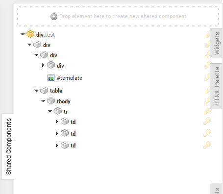
Creating a Shared Component
You can create new Shared Components by dragging and dropping an element from the Pages Tree View into the drop area at the top of the Shared Components flyout. When you do that, Structr copies the source element to the Shared Components flyout and moves all its children to the new copy. The source element becomes a so-called “synced node” that relays the rendering process to the Shared Component.
Unused Elements
The Unused Elements flyout is the “recycle bin” for elements. It contains all nodes that were removed from a page. You can usually find deleted elements here, and drag them back into the page.

Cleanup
You can clean the list of unused elements using the “Delete All” button. Doing so periodically can improve the performance of the Structr UI, especially if there is a large number of unused elements. That happens for example if you delete large structures or several pages.
Dialogs
Edit Properties Dialog
The Edit Properties Dialog is the universal configuration and editing dialog for objects. It can be found in nearly all sections of the Structr UI and opens on click of the Edit Properties button (). The number of tabs in this dialog depends on the type of object you are editing.
General
The “General” tab is only visible for Page objects, <div>-, <button> and <input> elements, and Users. For each of these, the dialog has slightly different content, so we only show the content for a <div> element here.
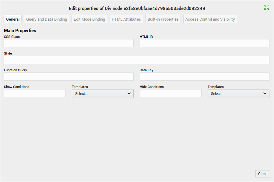
Main Properties
In the section “Main Properties” you can find the most important properties for the object you are editing. For a <div> element, those are the CSS class, the HTML id property and the CSS style attribute. Since divs are more likely to be dynamic elements, there are also input fields for Function Query, Data Key and Show / Hide Conditions.
Custom Properties
If the type of the object you are currently editing has custom properties, those properties will be shown in an editable table.
Query and Data Binding
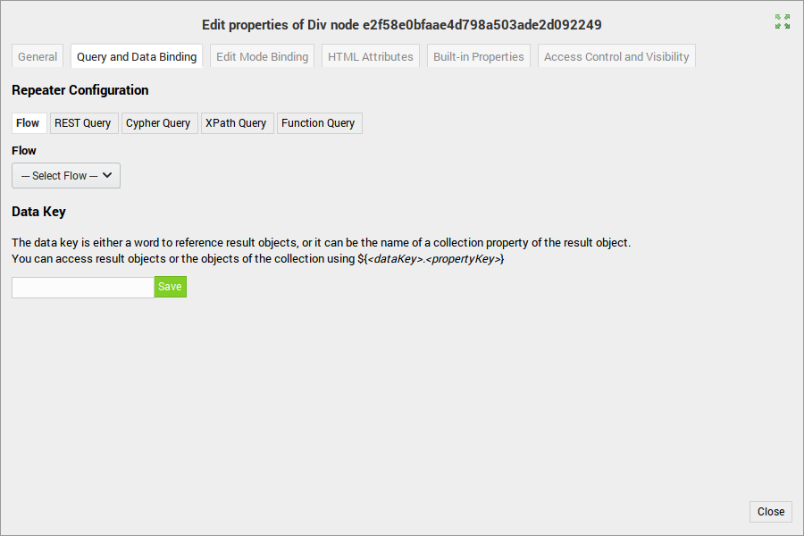
The Query and Data Binding Dialog provides access to the repeater configuration. You can select a data source for the repeater, which can either be a flow, a REST query, a Cypher query, an XPath query or a Function expression (called Function Query in this dialog).
Data Key
The data key input field defines a keyword that you can use in child elements of the repeater to access the current element.
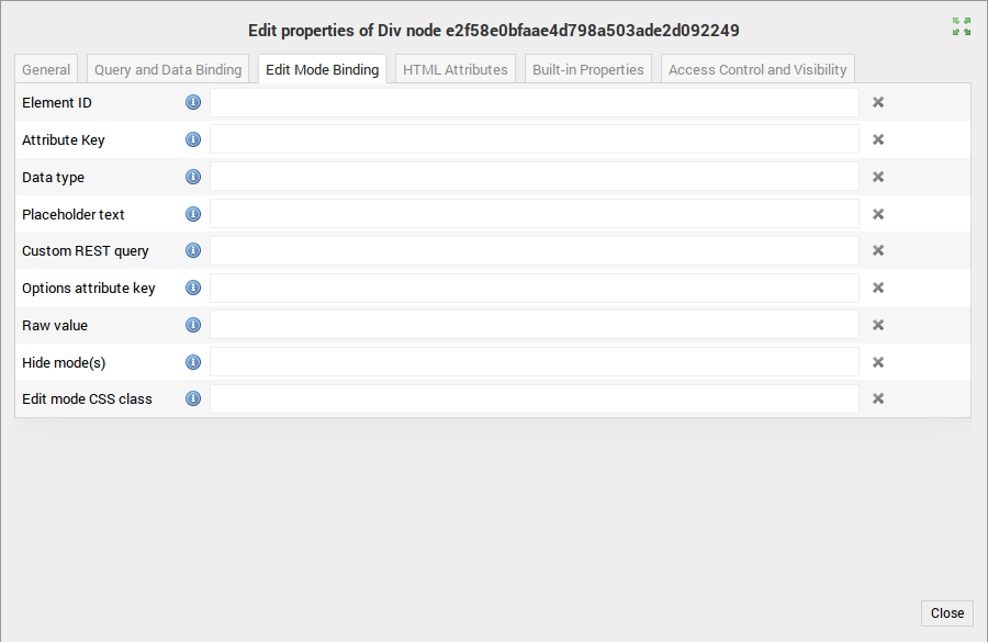
Edit Mode Binding
The Edit Mode Binding Dialog allows you to configure settings for a client-side JavaScript library that you can use in your Structr application to make your application interactive. It reacts to certain data- attributes on HTML elements and activates editing functionality based on the values by replacing the HTML element with an appropriate input element.
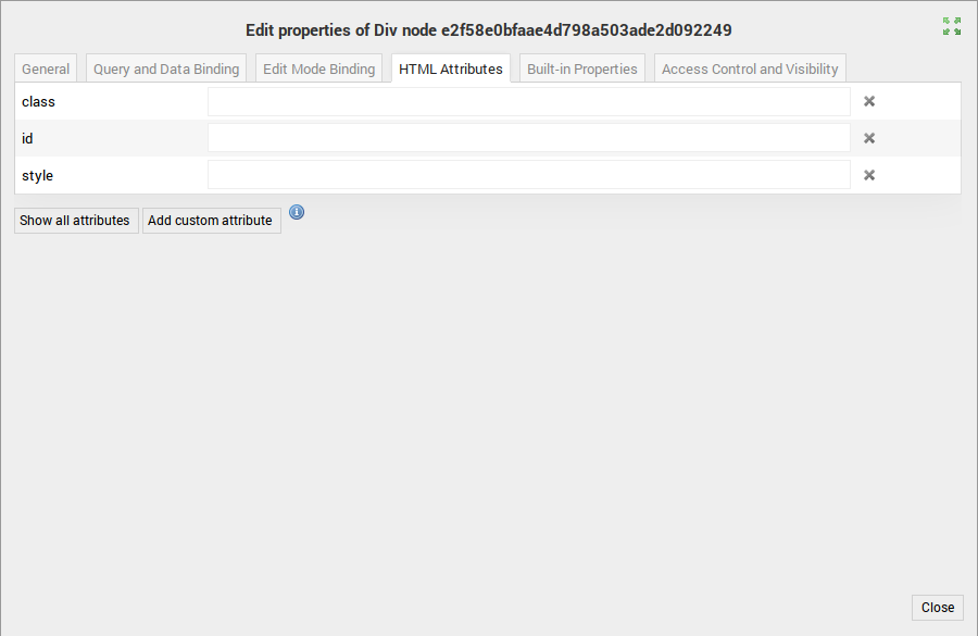
HTML Attributes
The HTML attributes dialog provides access to the standard HTML attributes like id, class, style etc. Only the most used attributes are shown initially, and you can click the “Show all attributes” button to see the full list.
Built-In Properties
The Built-In properties dialog provides access to the internal Structr attributes of a node or relationship. This is the place where you can find visibility flags, show and hide conditions and other internal properties.

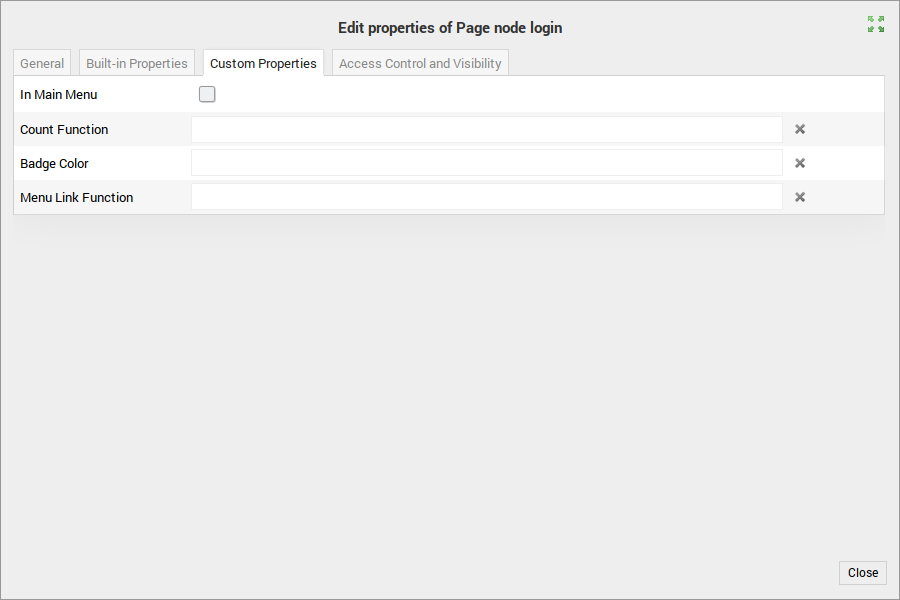
Custom Properties
The Custom properties dialog provides access to the custom properties of a node or relationship as defined in the schema. The tab will only be visible if the current object has custom schema properties defined.
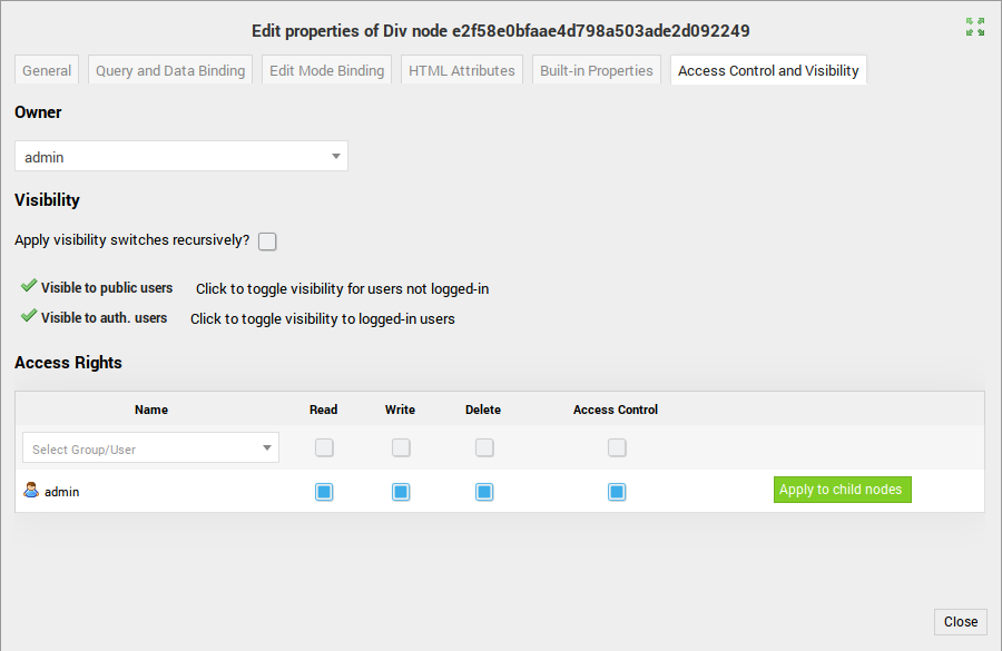
Access Control and Visiblity
The Access Control and Visibility dialog provides access to the security settings of a node. In this dialog, you can set, edit or remove the owner of the node, set visibility flags and configure security releationships.
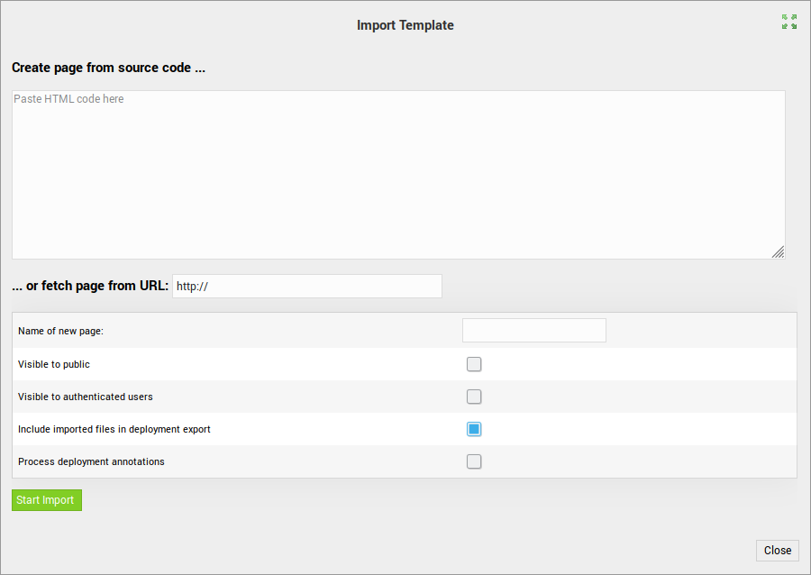
Import Template Dialog
The Import Template dialog provides access to the HTML importer. You can import an HTML snippet or fetch content from a URL to create a new page.
Edit Preview Settings Dialog
The Edit Preview Settings dialog allows you to configure the URL used to render the current page in the preview area. You can for example provide the UUID of a details object, or configure request parameters that are then used in the rendering process of the preview.
You can also disable the automatic refresh of the preview page when you make changes in the page tree. This is especially useful if the preview page takes a long time to render and you want to avoid rendering the page for each change.

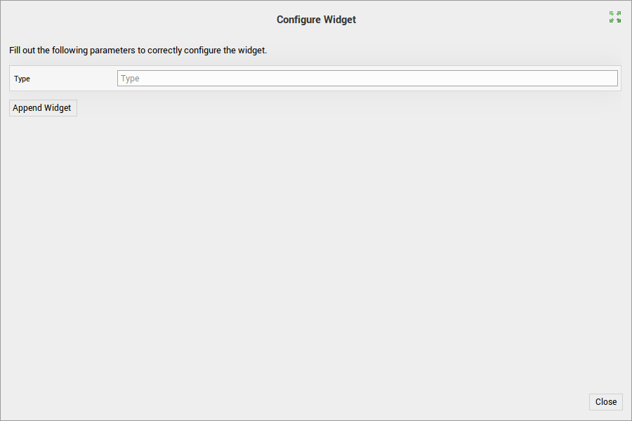
Configure Widget Dialog
The Configure Widget Dialog appears when you insert a parameterized Widget into a page. If the Widget source contains variables, you have to provide a value for each variable, otherwise the Widget cannot be appended to the page.
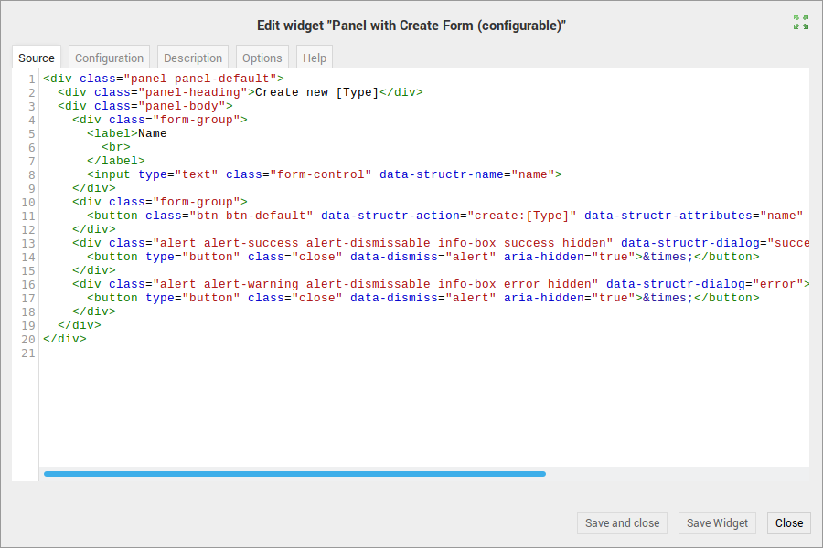
Edit Widget Dialog
The Edit Widget Dialog is the main editing and configuration interface for Widgets. The dialog consists of several tabs that allow you to configure the different aspects of the Widget.
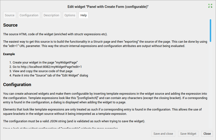
Source
The Source tab allows you to edit the HTML source code of the Widget.
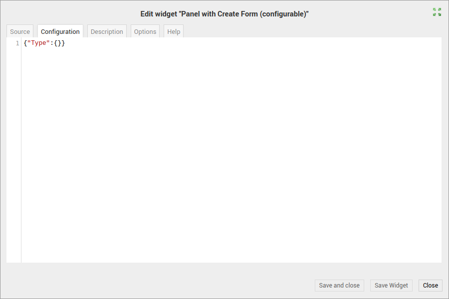
Configuration
The Configuration tab allows you to specify a JSON object that configures the options available when you insert the Widget into a page. Please see the Help tab for a more detailed description of the configuration format.
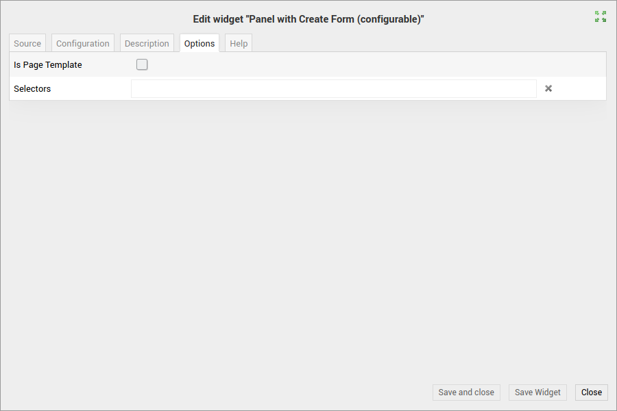
Options
The options tab contains configuration options for the widget. If you check the Is <a data-id="06295f219bad4f4dbb0fbadbac982c85" class="mention">Page</a> Template checkbox, Structr expects the Widget to contain a complete HTML document and makes it available under a special button in the Pages Area. You can use the selectors field to specify CSS selectors which determine the HTML elements in the Page Tree where the Widget can be inserted using the right-click menu.
Help
The Help tab contains detailed descriptions and instructions for all the Widget configuration options.
Widget Servers Dialog
The Widget Servers Dialog allows you to manage the available Widget servers.